Interactives
As Director of Data Visualization and Infographics at The Wall Street Journal, I led a cross-disciplinary team of more than 25 graphics editors, news app developers, data journalists, and designers. Together, we produced visual content across all of the Journal’s platforms. Under my leadership, the team received national and international recognition, including Kantar’s Information is Beautiful Gold Medal, the Online News Association Award for Excellence and Innovation in Visual Digital Storytelling, and multiple awards from the Society for News Design.

Explore, country by country, access to water and sanitation and see what’s changed since 1990.
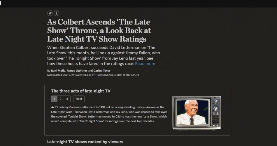
As Stephen Colbert ascends 'The Late Show' throne, a look back at late-night TV show ratings.
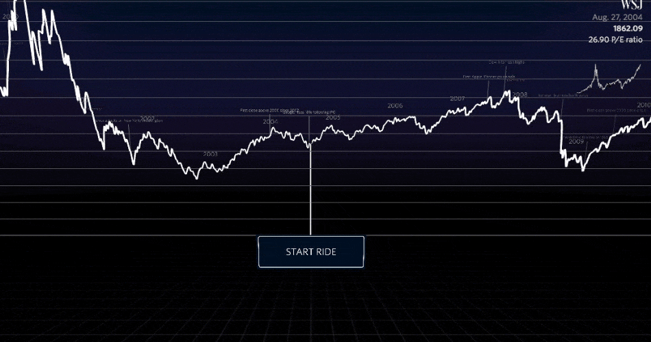
Explore the NASDAQ through a 3D interactive chart showing major events and turning points.
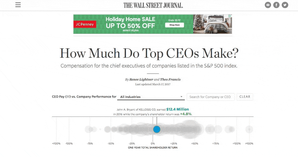
Track compensation for the chief executives of companies listed in the S&P 500 index.

The Madness Machine: Make an NCAA tournament bracket in 60 seconds.
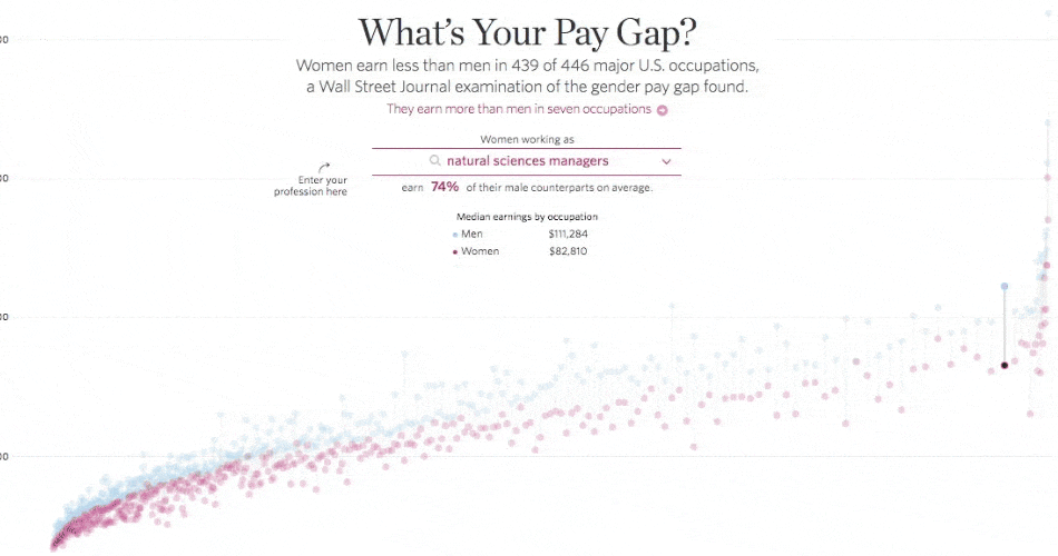
What’s Your Pay Gap? The gender pay gap is a lot bigger than you think.
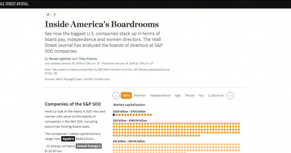
How the biggest companies stack up in terms of board pay, independence, and women directors.
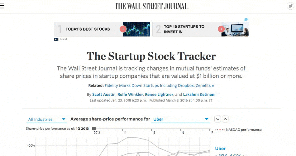
Track changes in mutual funds' estimates of share prices in startup companies.
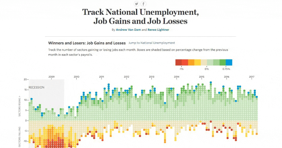
Winners and Losers: Track national unemployment, job gains, and job losses.
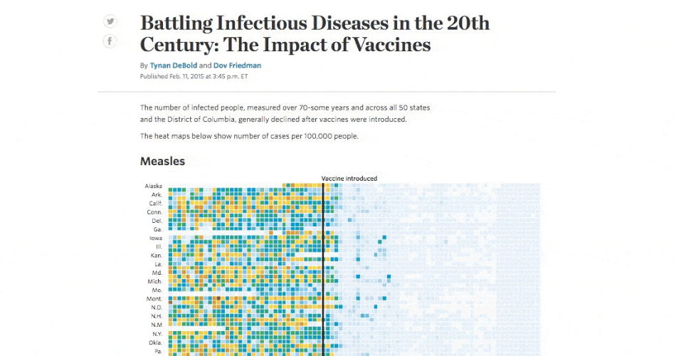
Battling Infectious Diseases in the 20th Century: The Impact of Vaccines.