Data Visualization
Over the past two decades in the data visualization field, I’ve worked on a wide range of projects, including designing and implementing design systems, building charting tools, and developing training programs and best-practice guidelines.
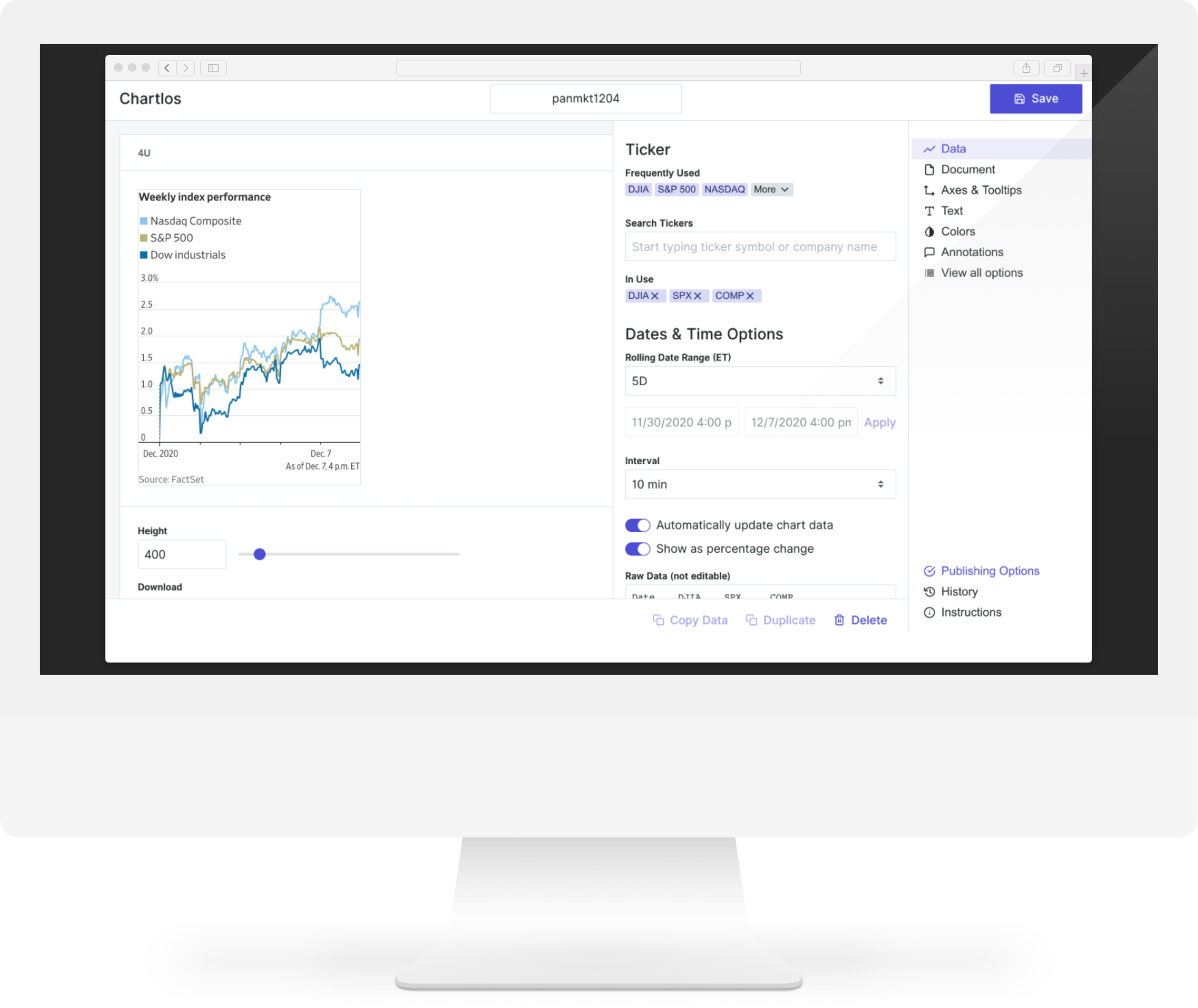
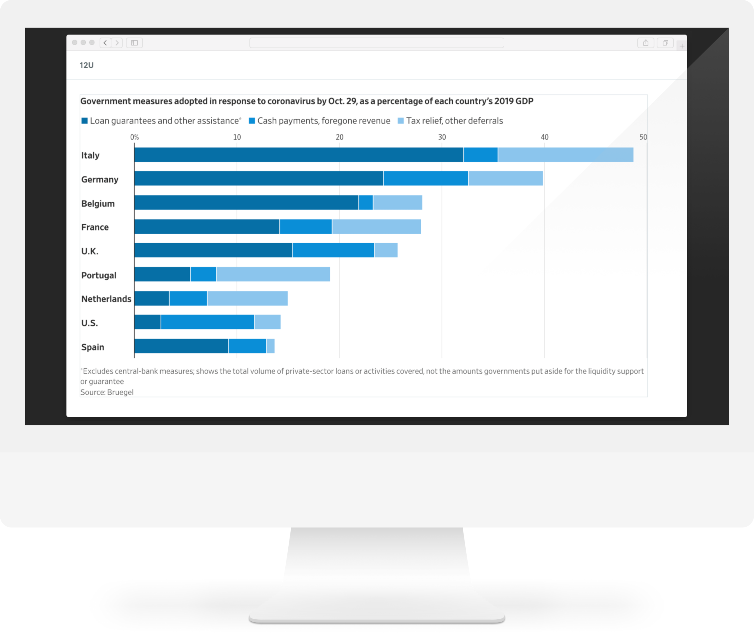
Chartlos
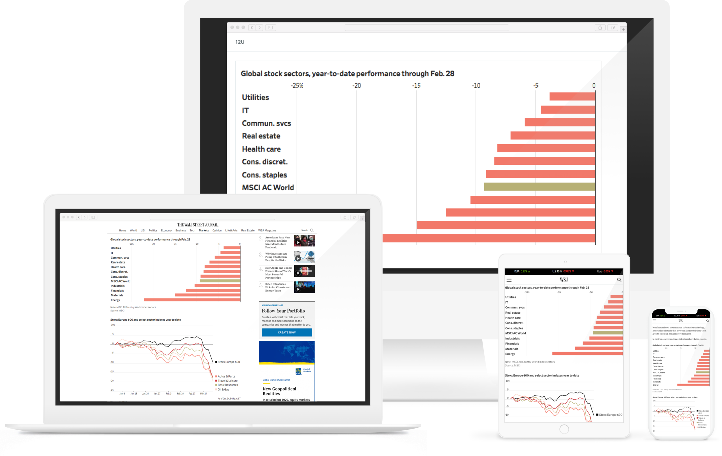
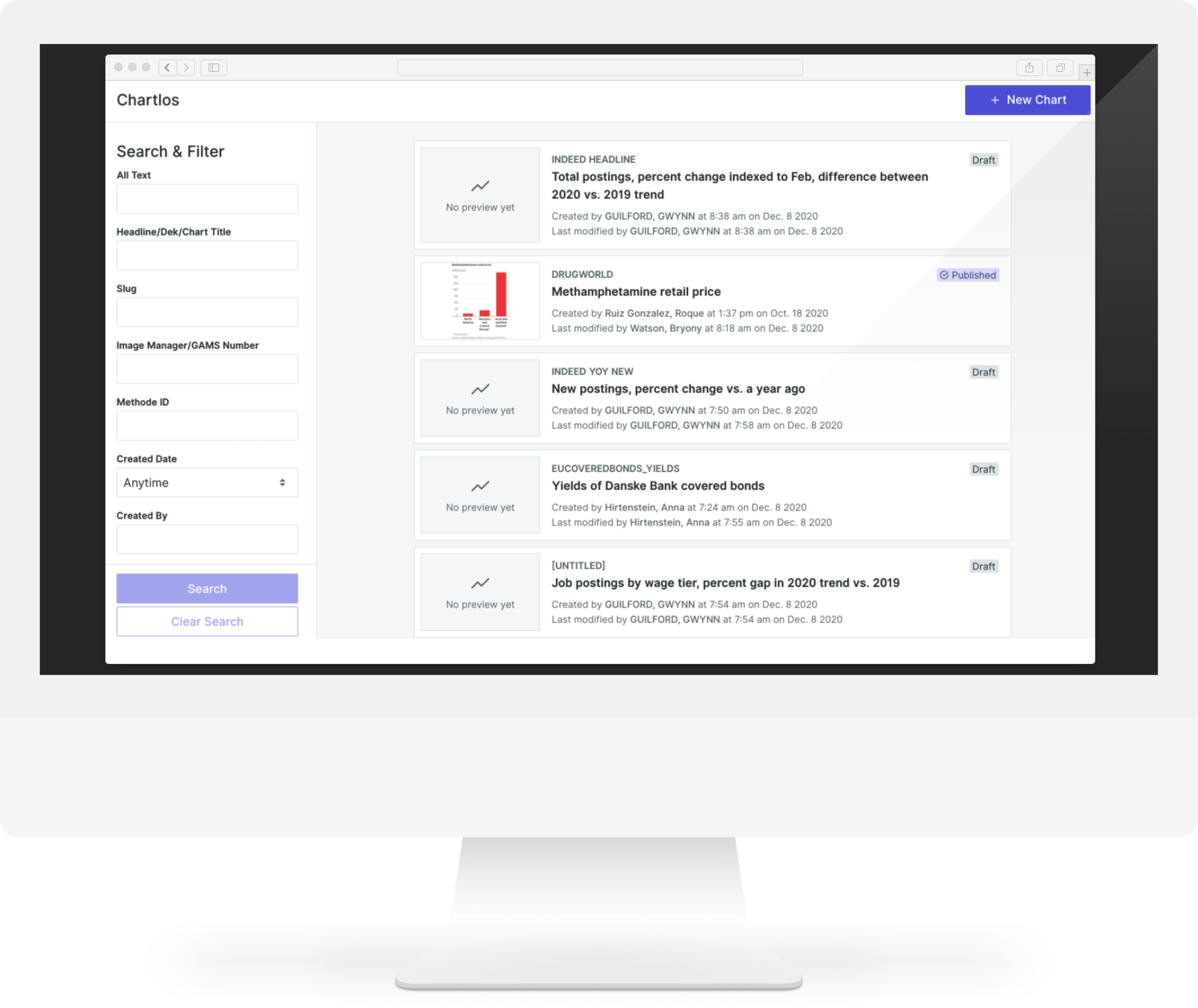
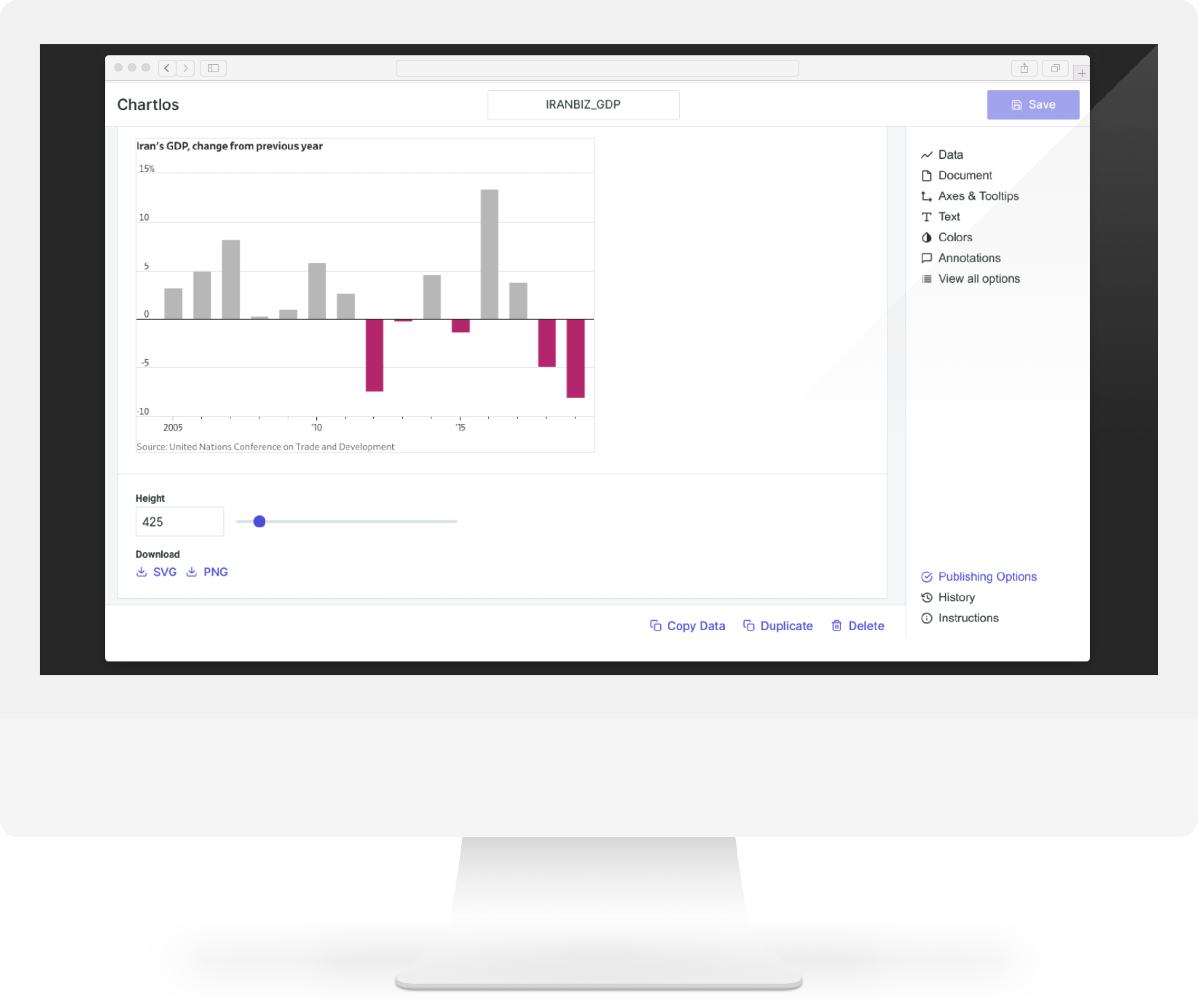
During my tenure as Director of Data Visualization and Infographics at The Wall Street Journal, I led a team that created multiple tools for data storytelling. One example is Chartlos, a platform-agnostic tool that enables reporters, editors, and graphic artists to quickly create and customize graphics across a wide range of formats while adhering to the publication’s visual standards.
GS Dashboards
At Goldman Sachs, as part of the User Experience team, I contributed to the development of several high-performance data visualization products and tools. One of these, GS Dashboards, allows users to build interactive dashboards with real-time access to the firm’s key data sources.
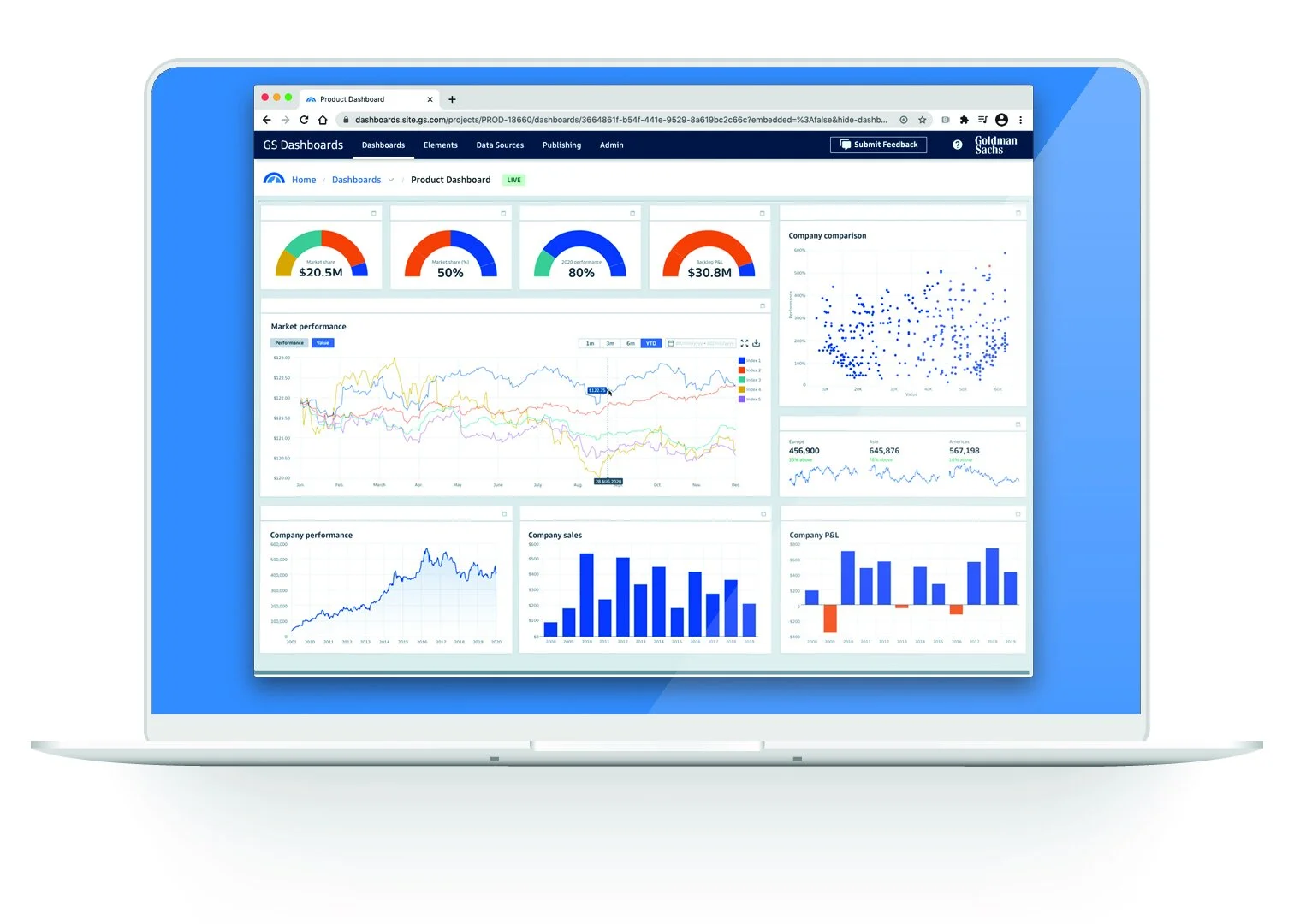
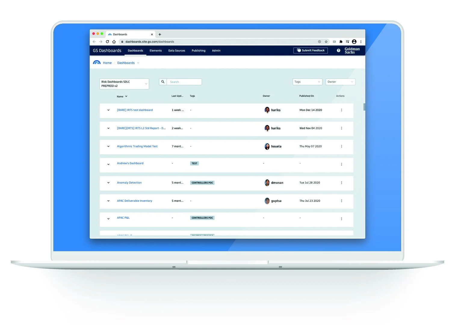
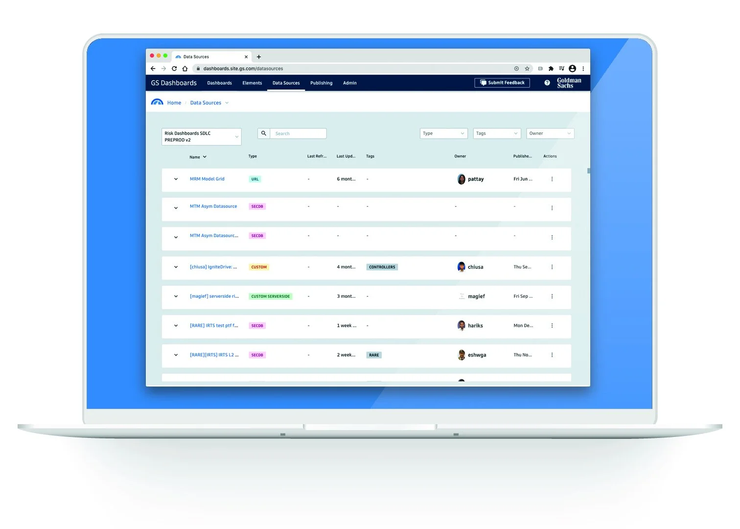
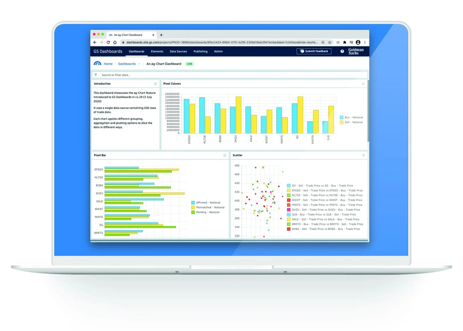
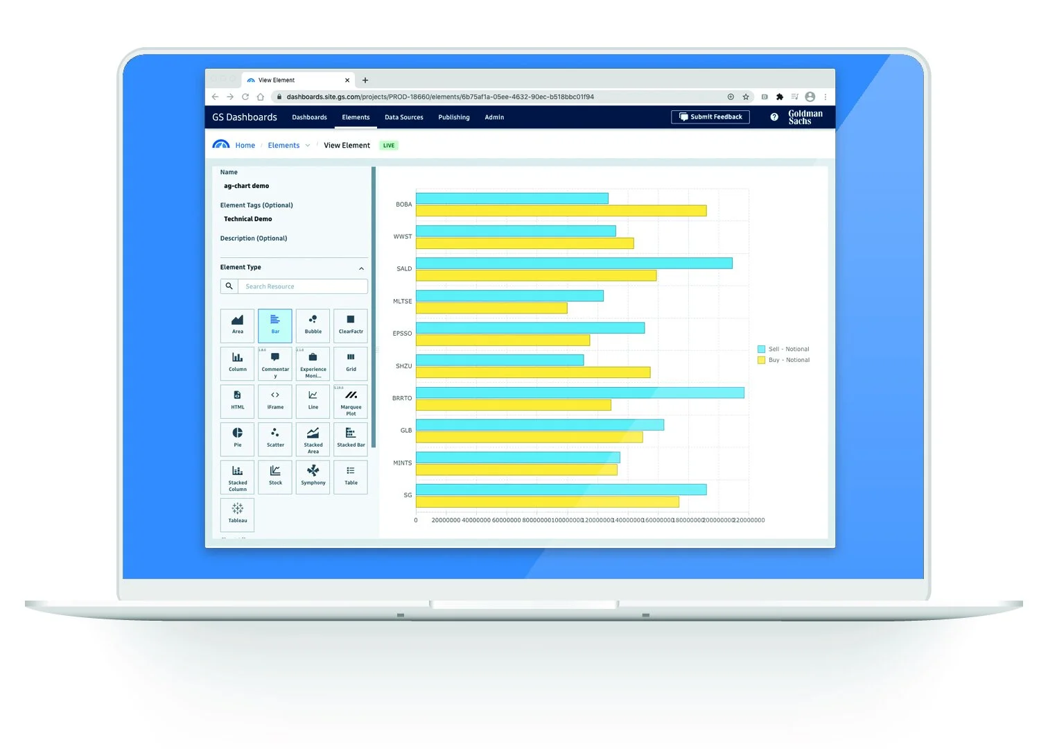
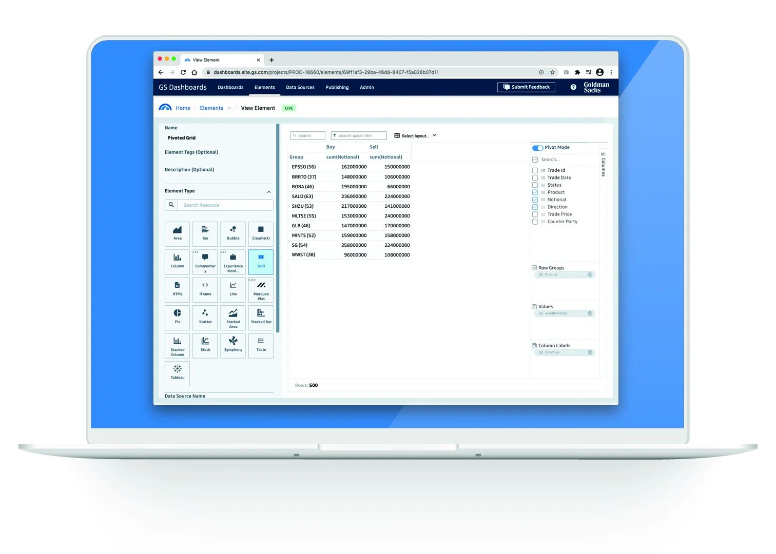
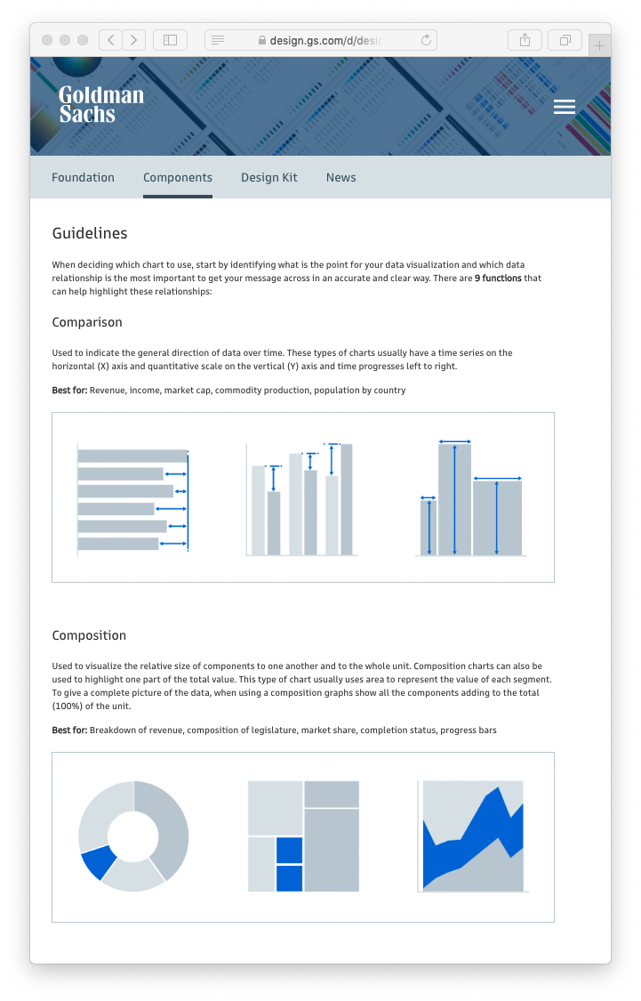
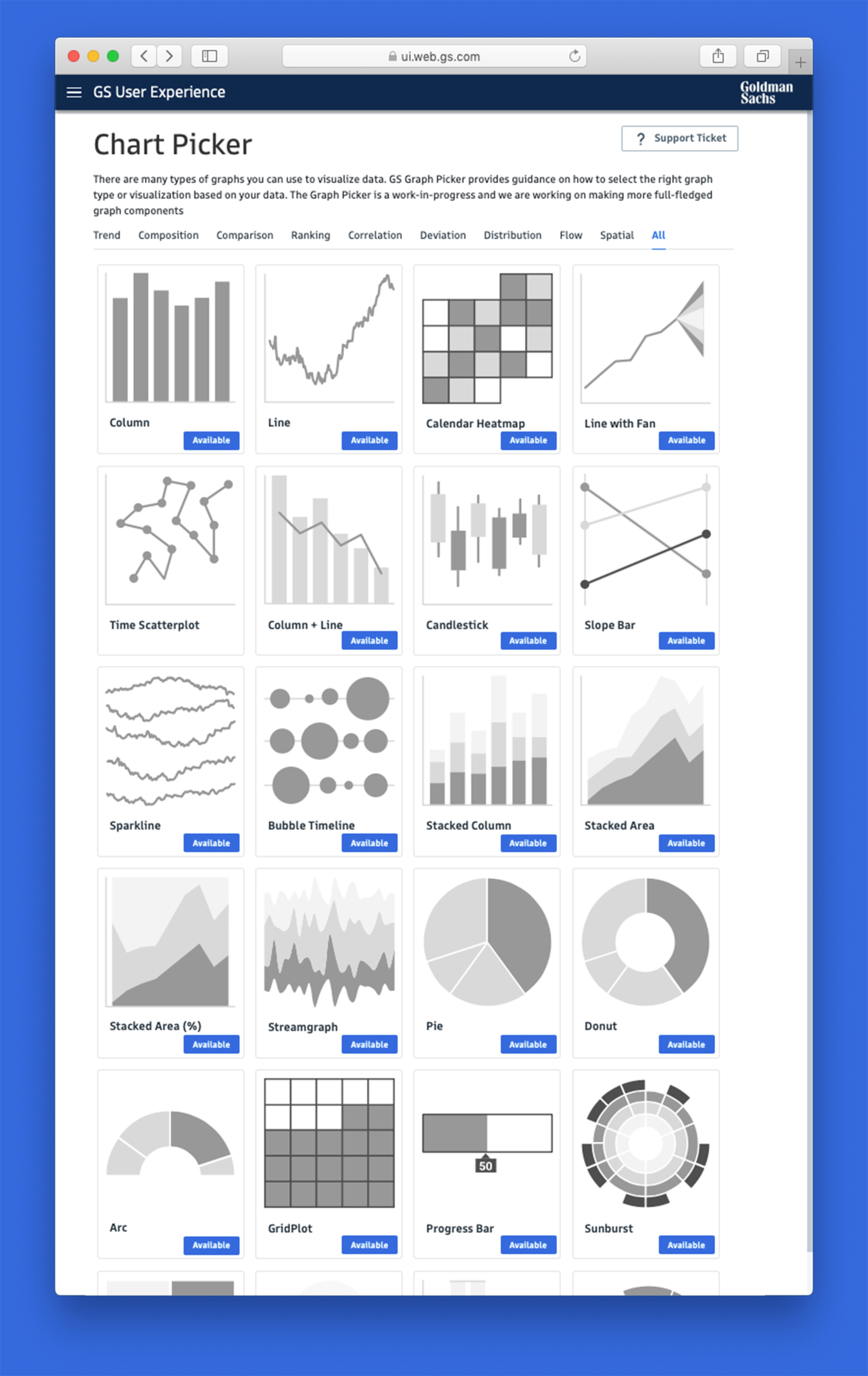
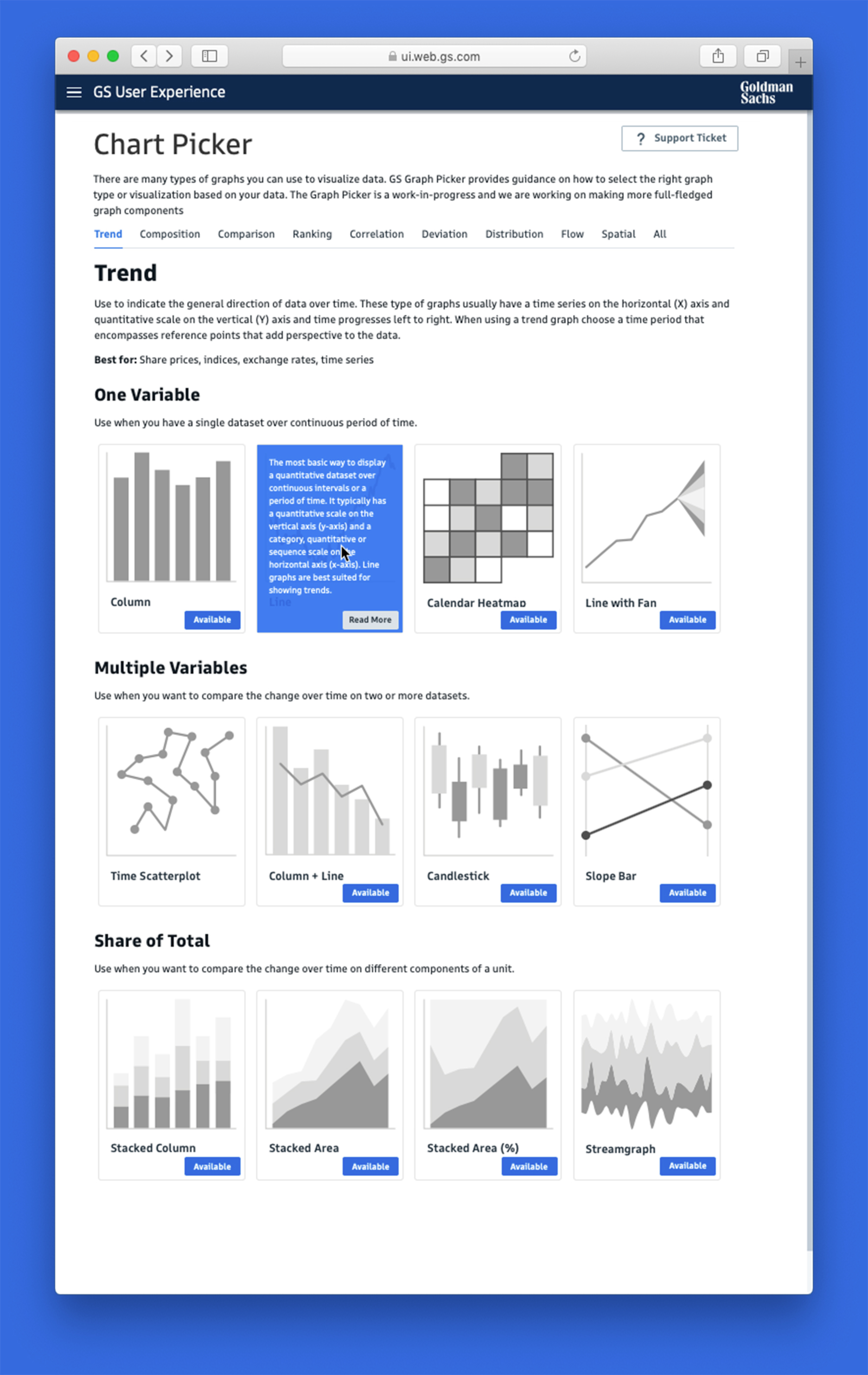
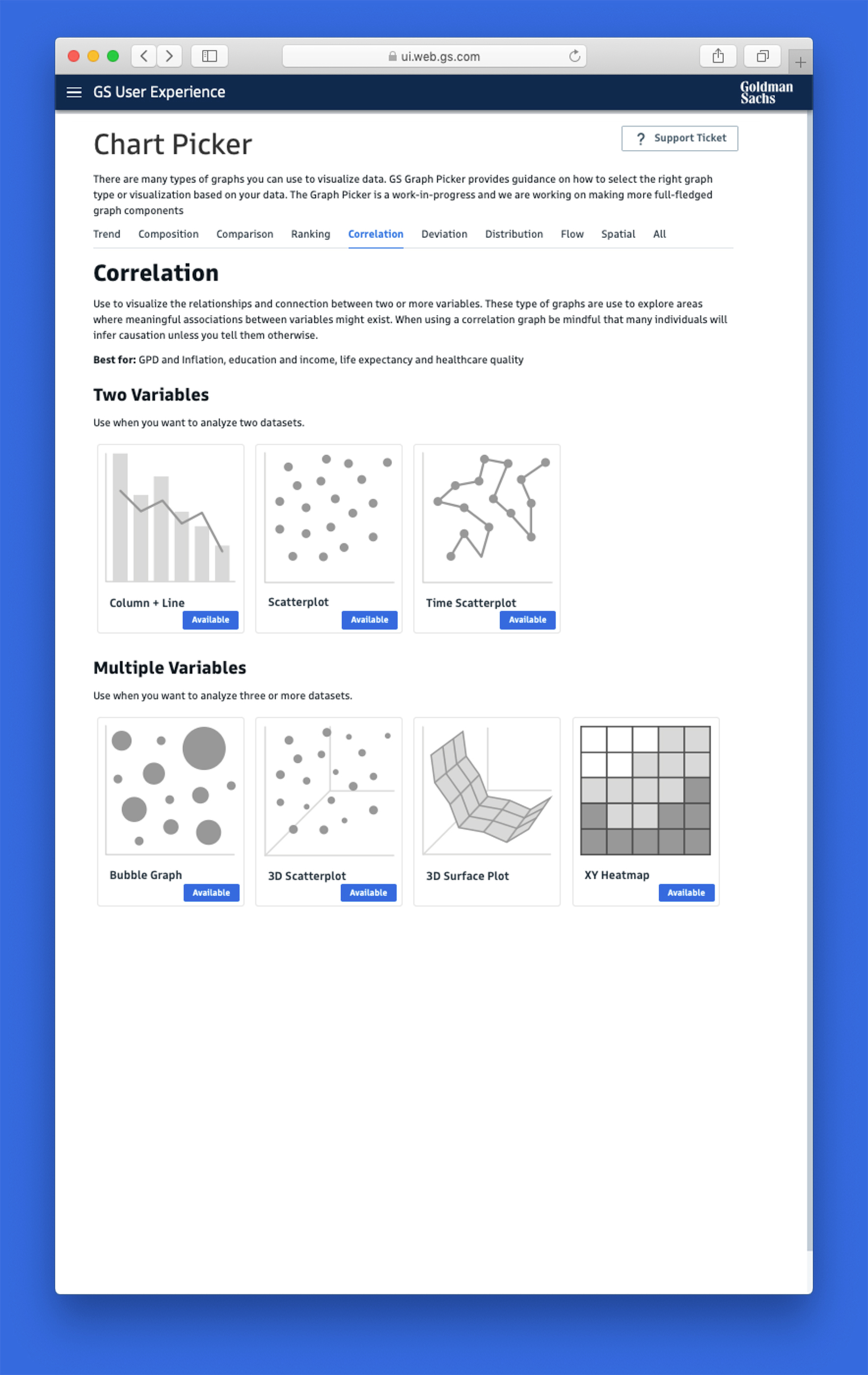
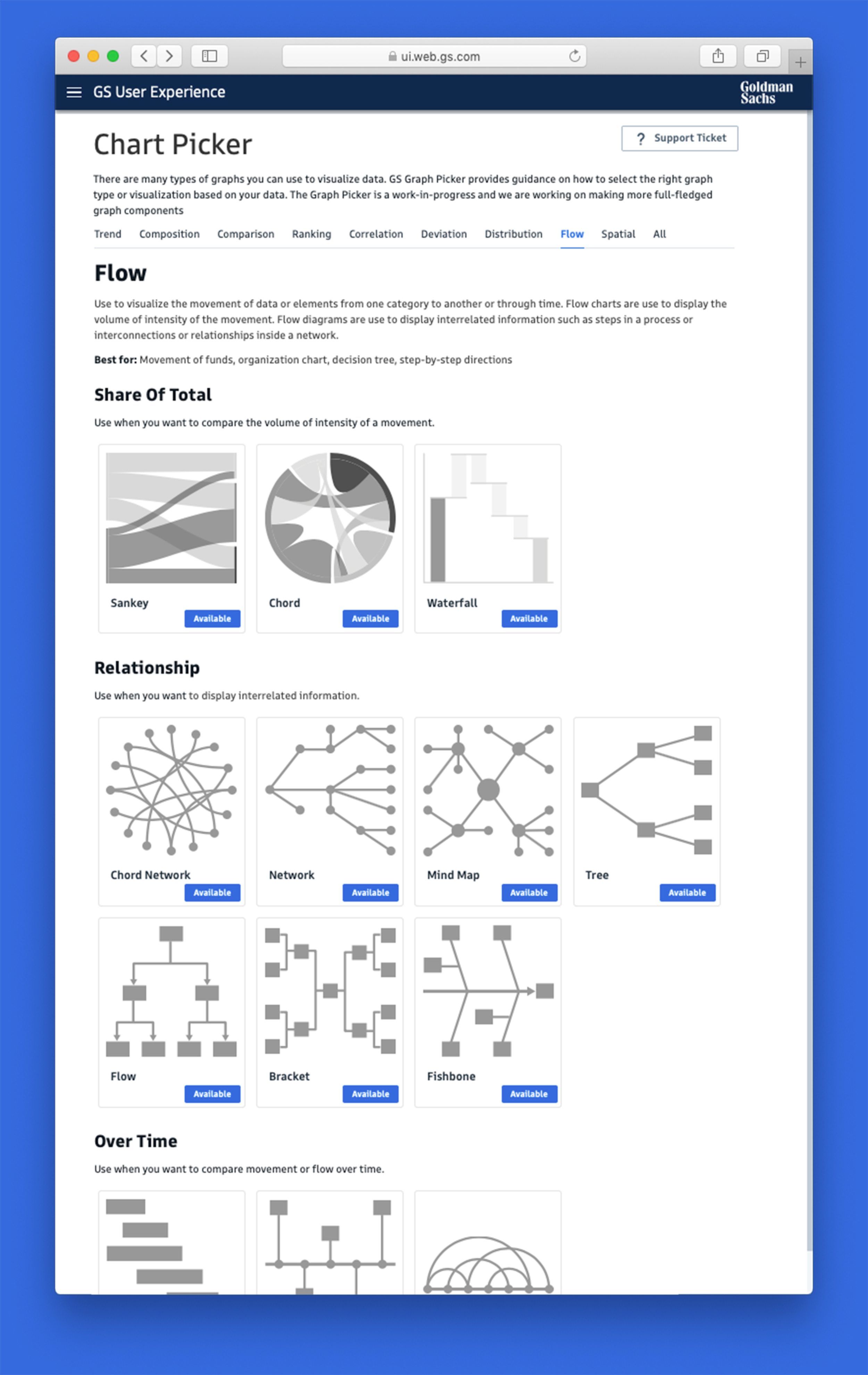
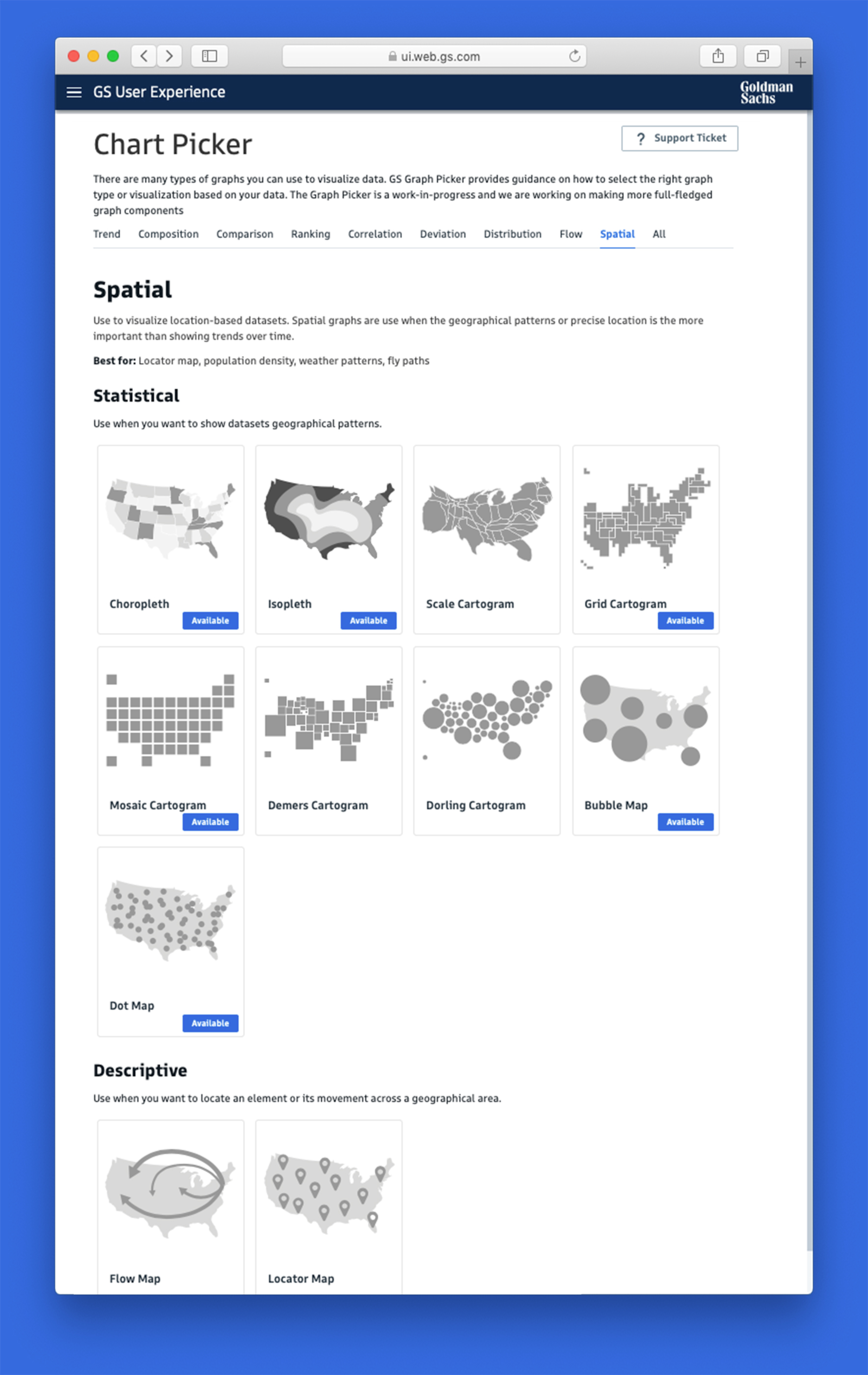
Chart Picker
As part of leading Goldman Sachs’ data visualization strategy, I developed best practices and guidelines. The GS Chart Picker, for example, helps designers and developers select the most appropriate chart type based on their data.
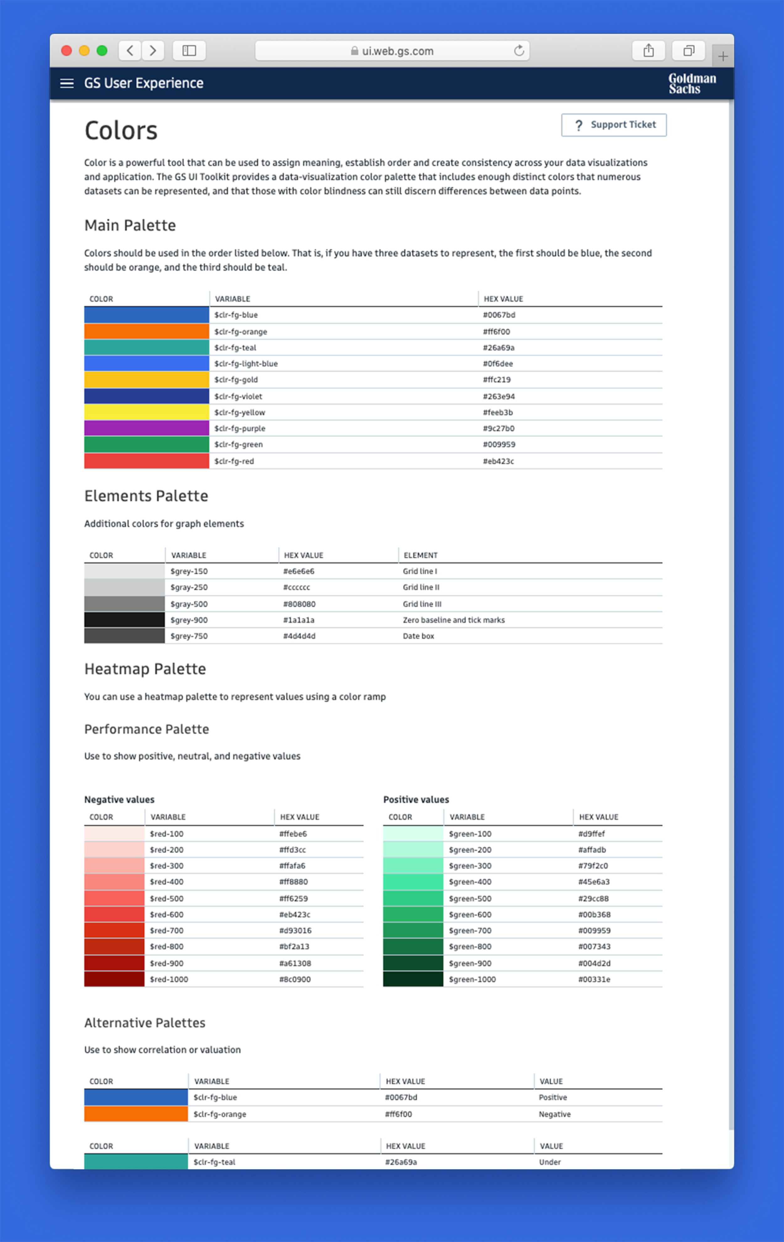
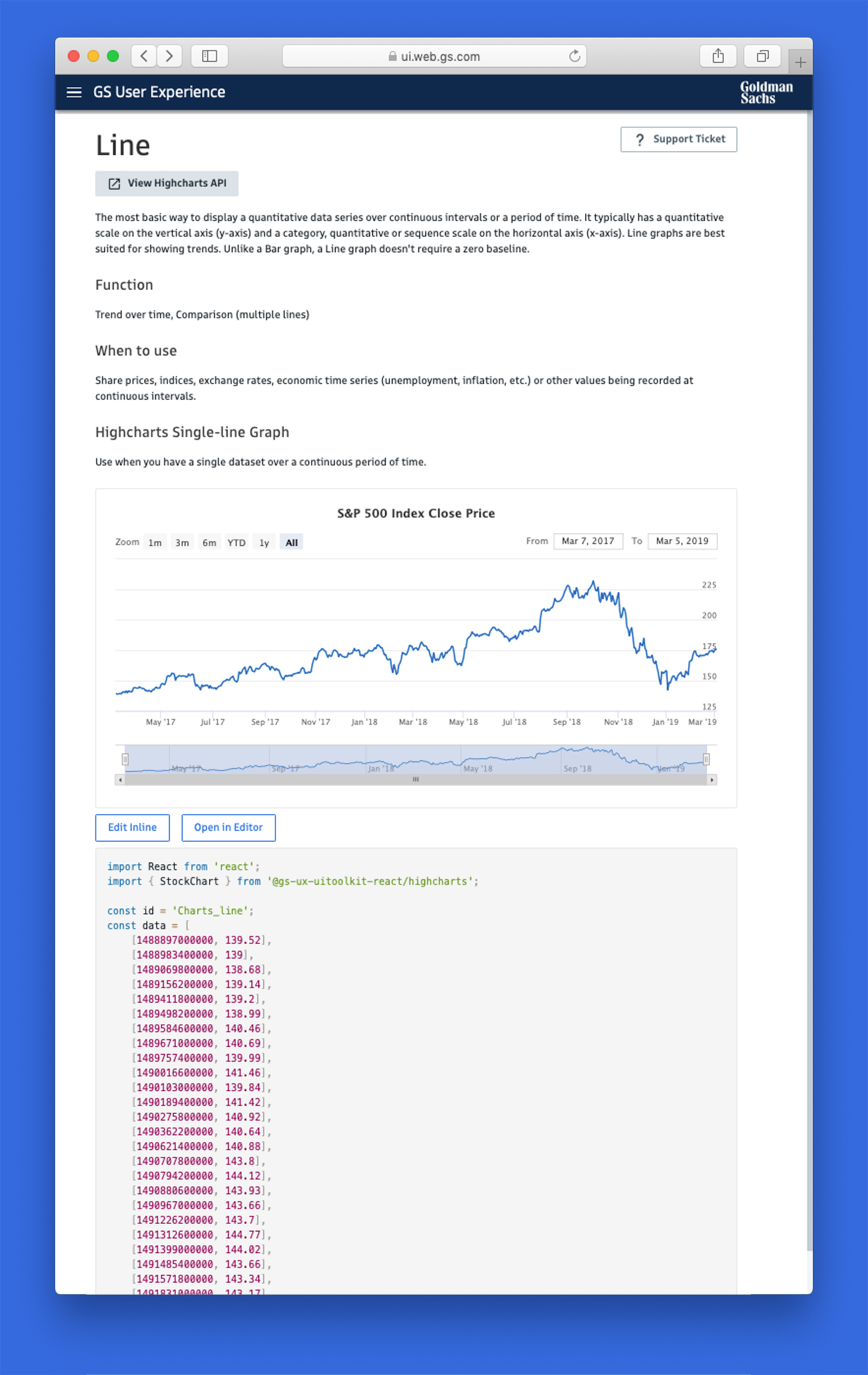
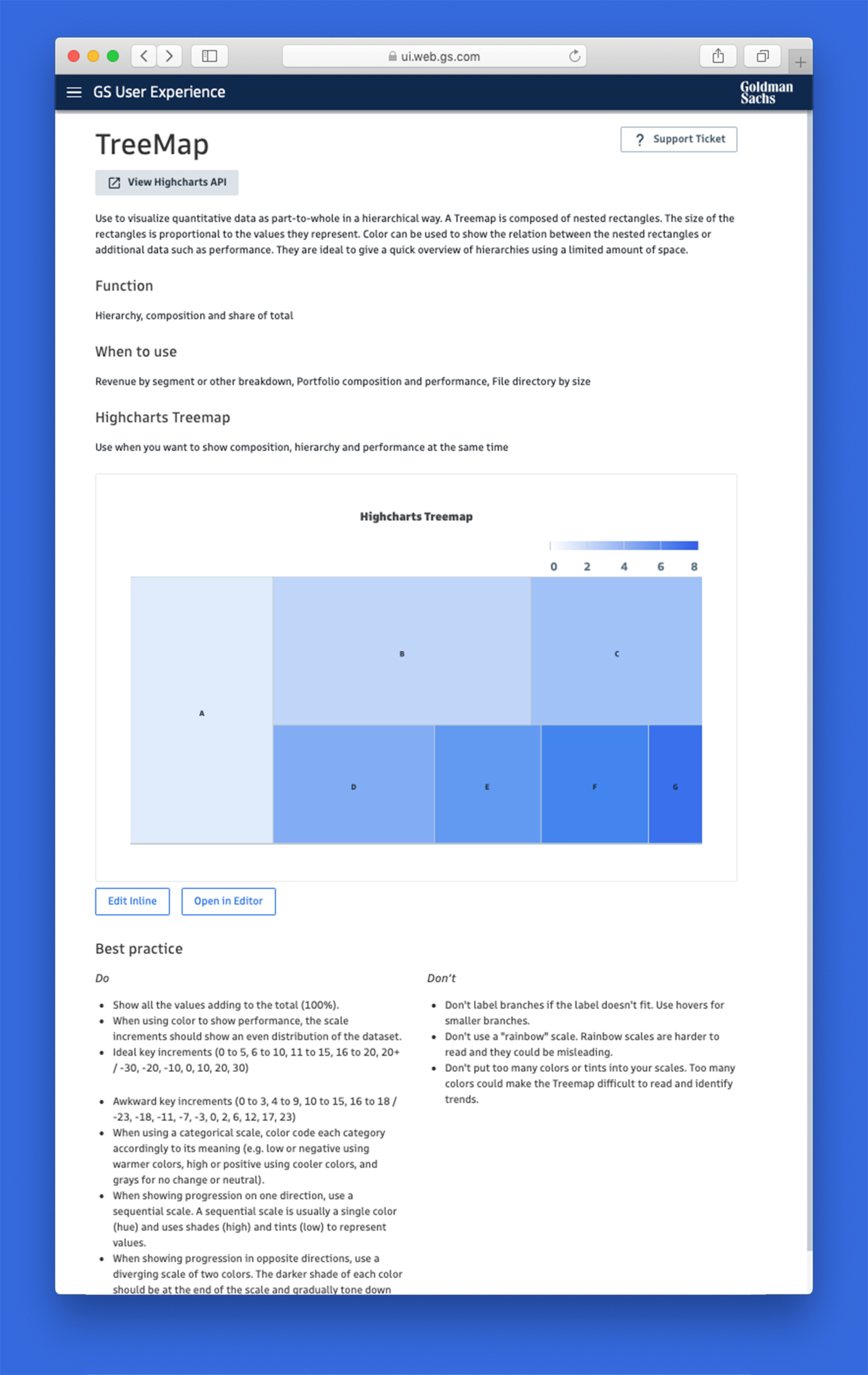
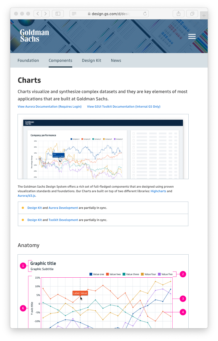
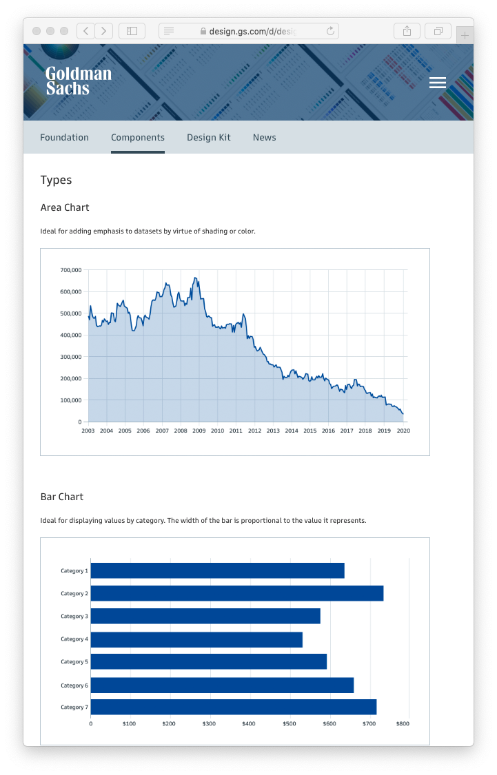
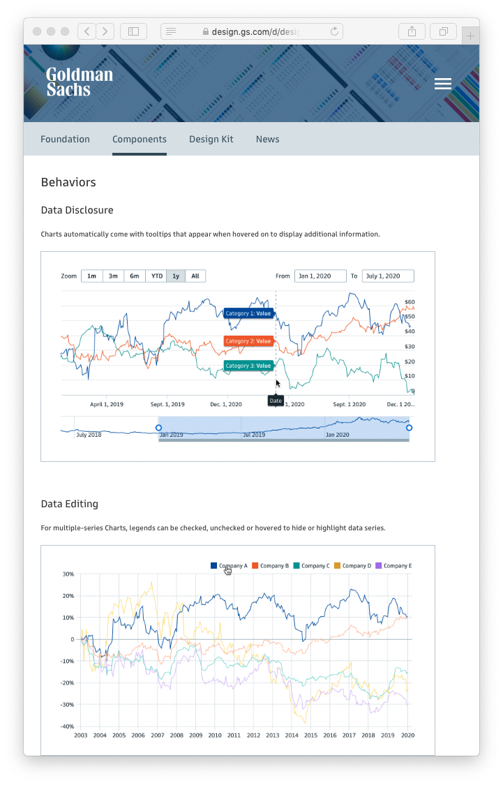
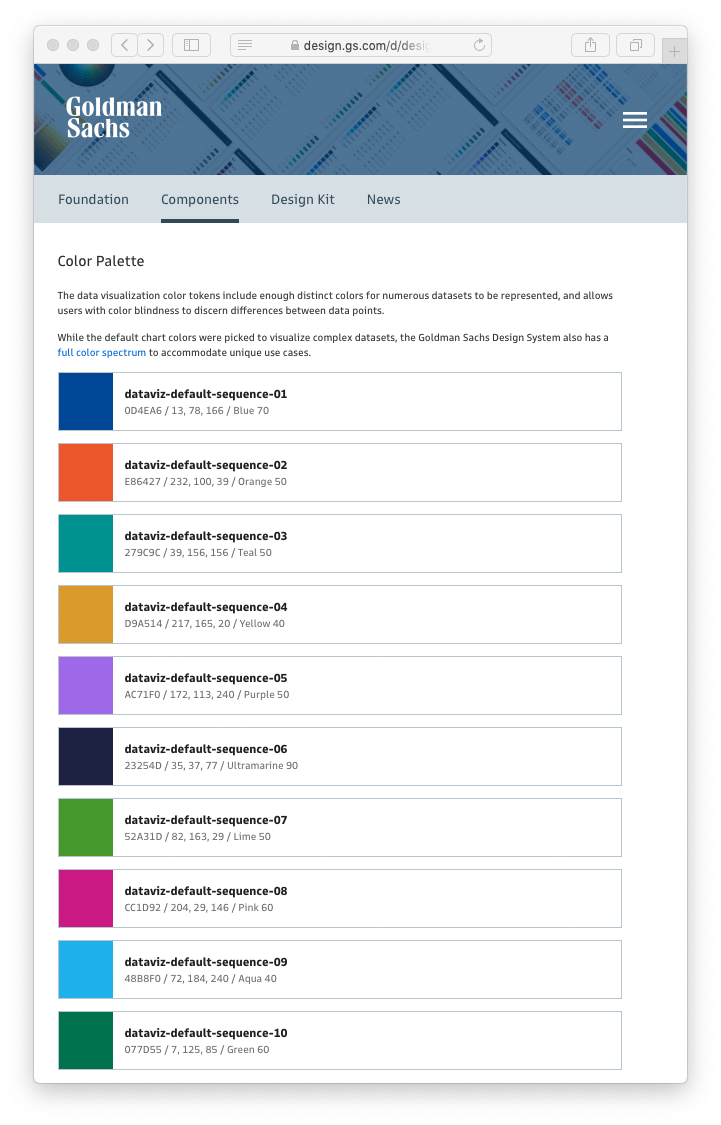
Data Visualization Design System
I also designed and developed chart components for the Goldman Sachs Design System. These components help visualize and synthesize complex datasets and serve as critical building blocks across many of the firm’s applications.