UX Design
I’m a design leader with over 15 years of experience designing and developing award-winning products, applications, and tools, with a focus on mobile and data visualization.
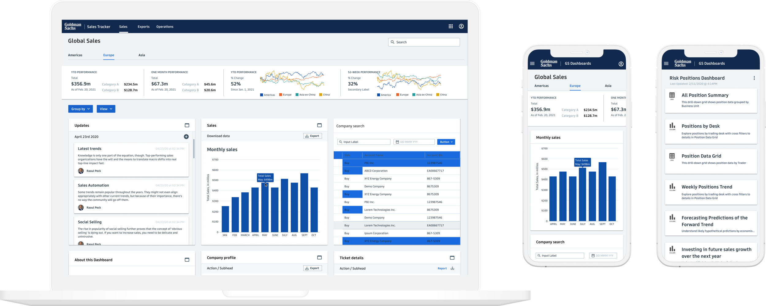
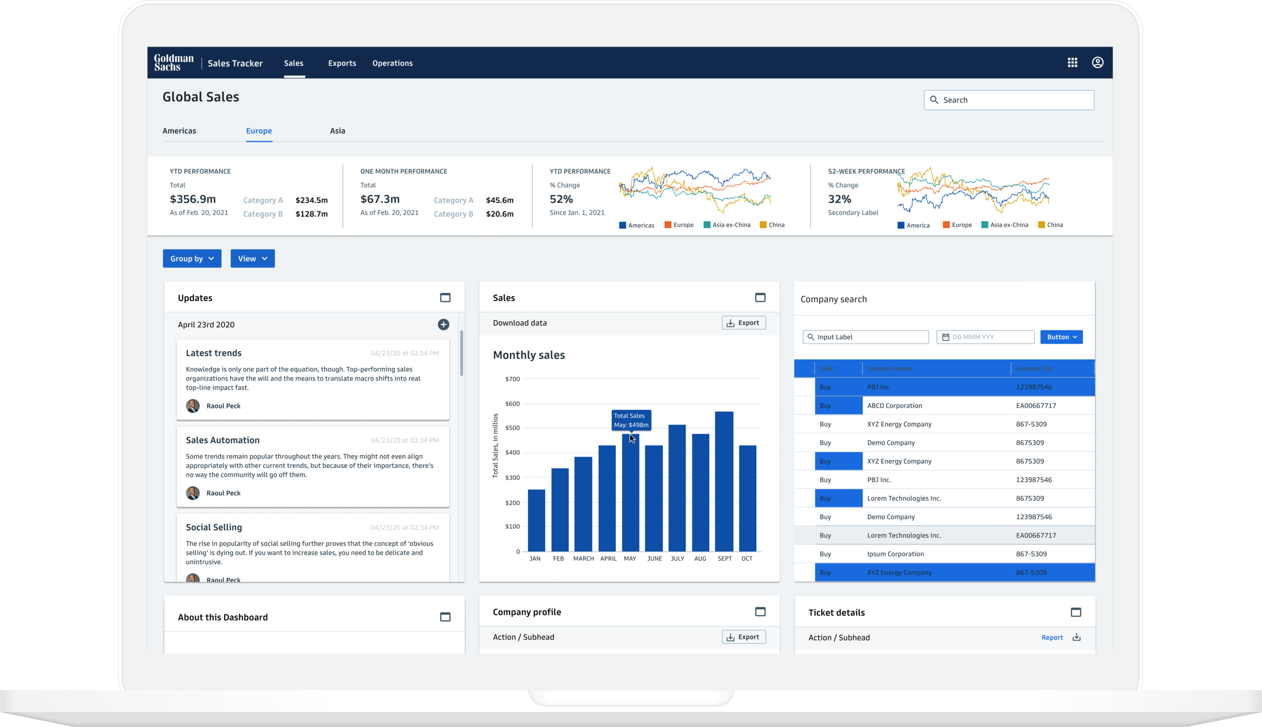
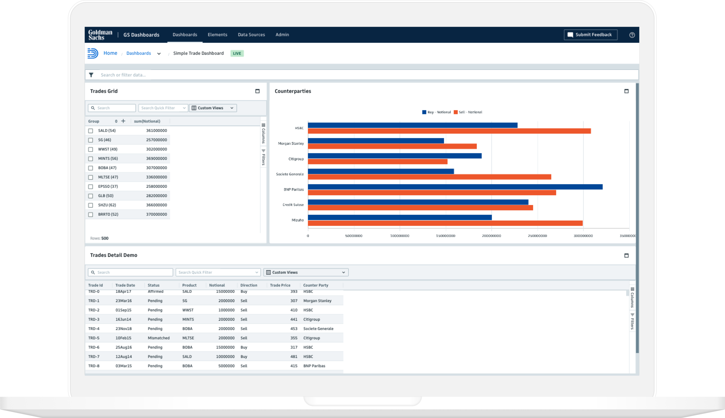
GS Dashboards
GS Dashboards is a data exploration, presentation, and publishing suite that provides direct, real-time access to the firm’s key data sources.
The Problem
Teams across Goldman Sachs required a solution to enable them to access, explore, and communicate real-time data effortlessly, effectively, and at scale.
The Goal
The objective was to design an application that allows users to create and share professional dashboards using the best charting and grid technologies.
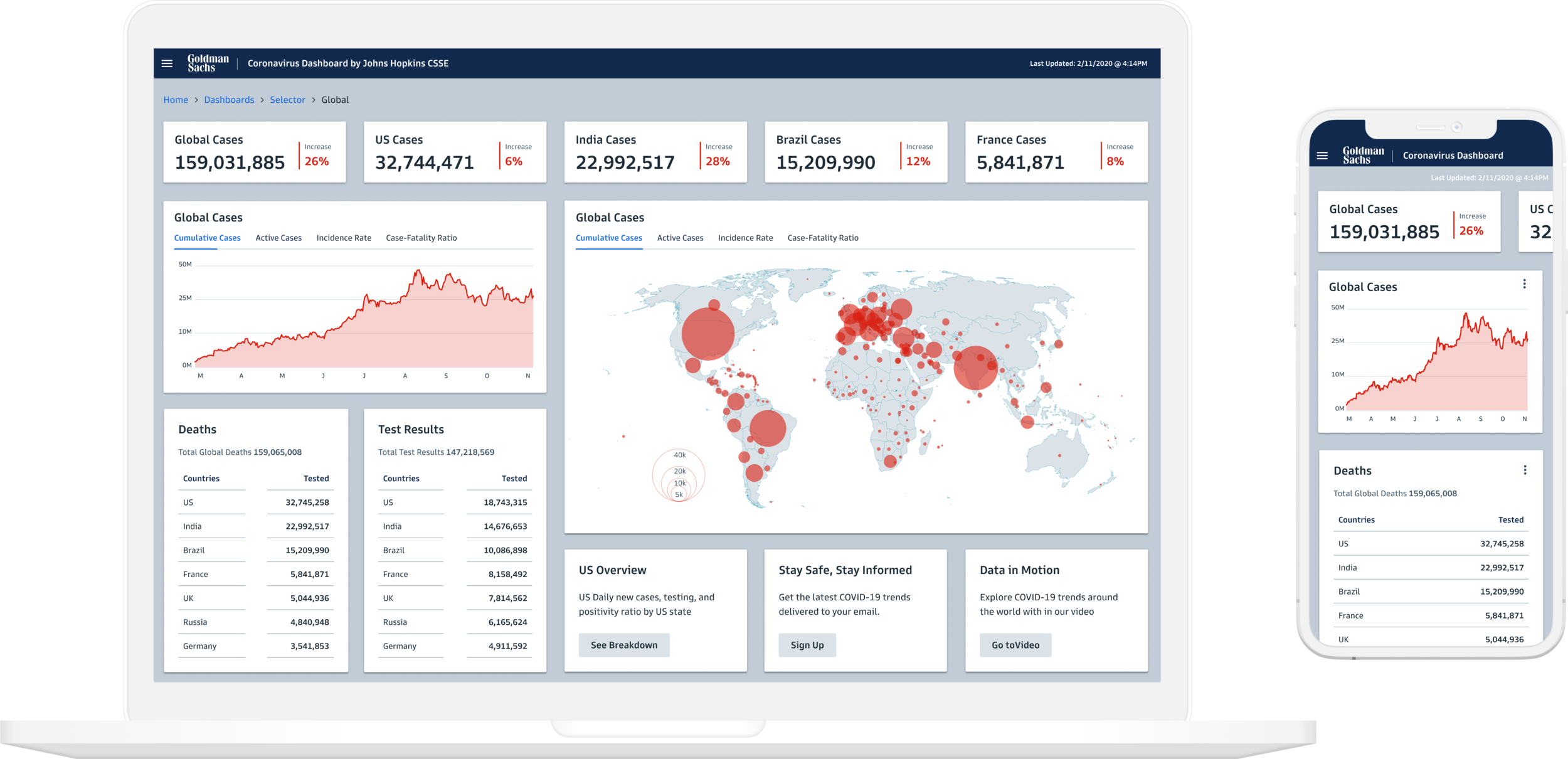
The application allows users access to a mobile version designed and optimized for different viewports.
Users can embed dashboards in other applications or share directly from the tool.
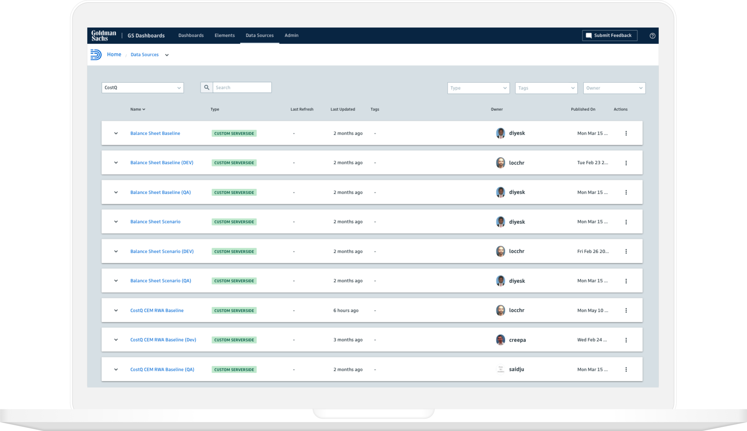
Users can define a location or connection for their data through the firm’s key data sources.
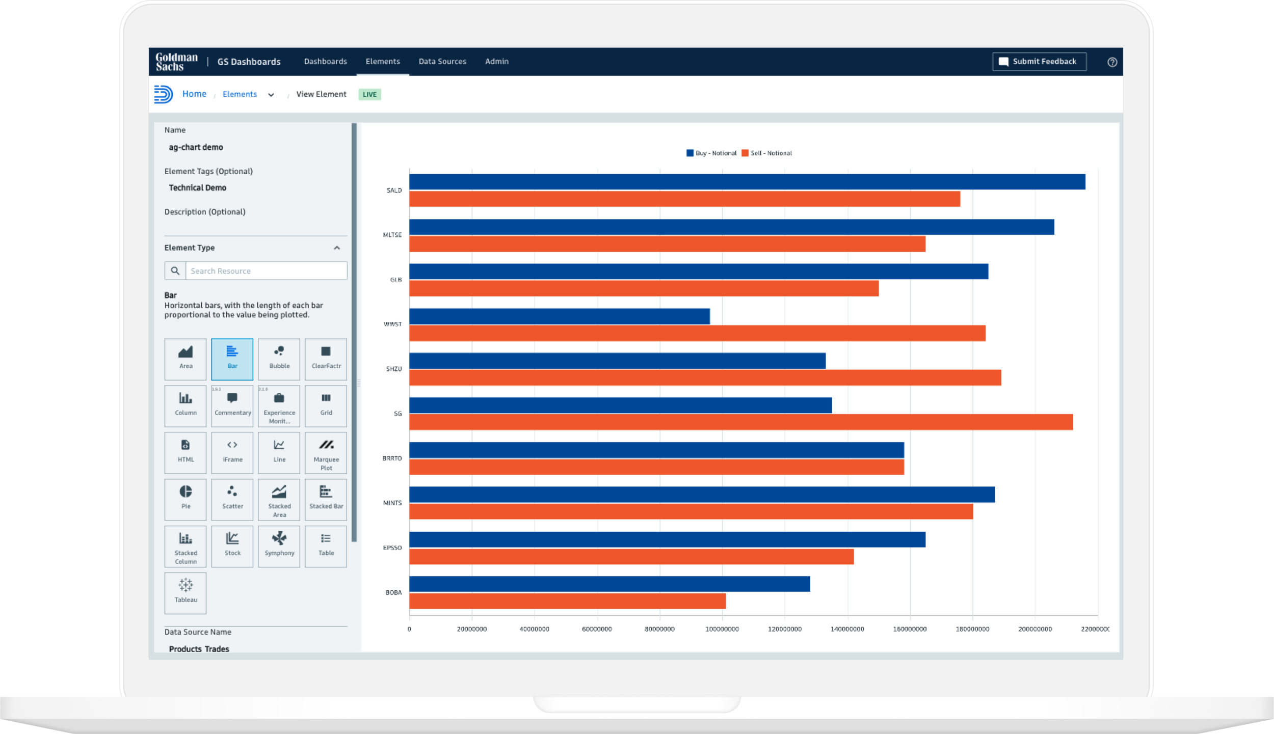
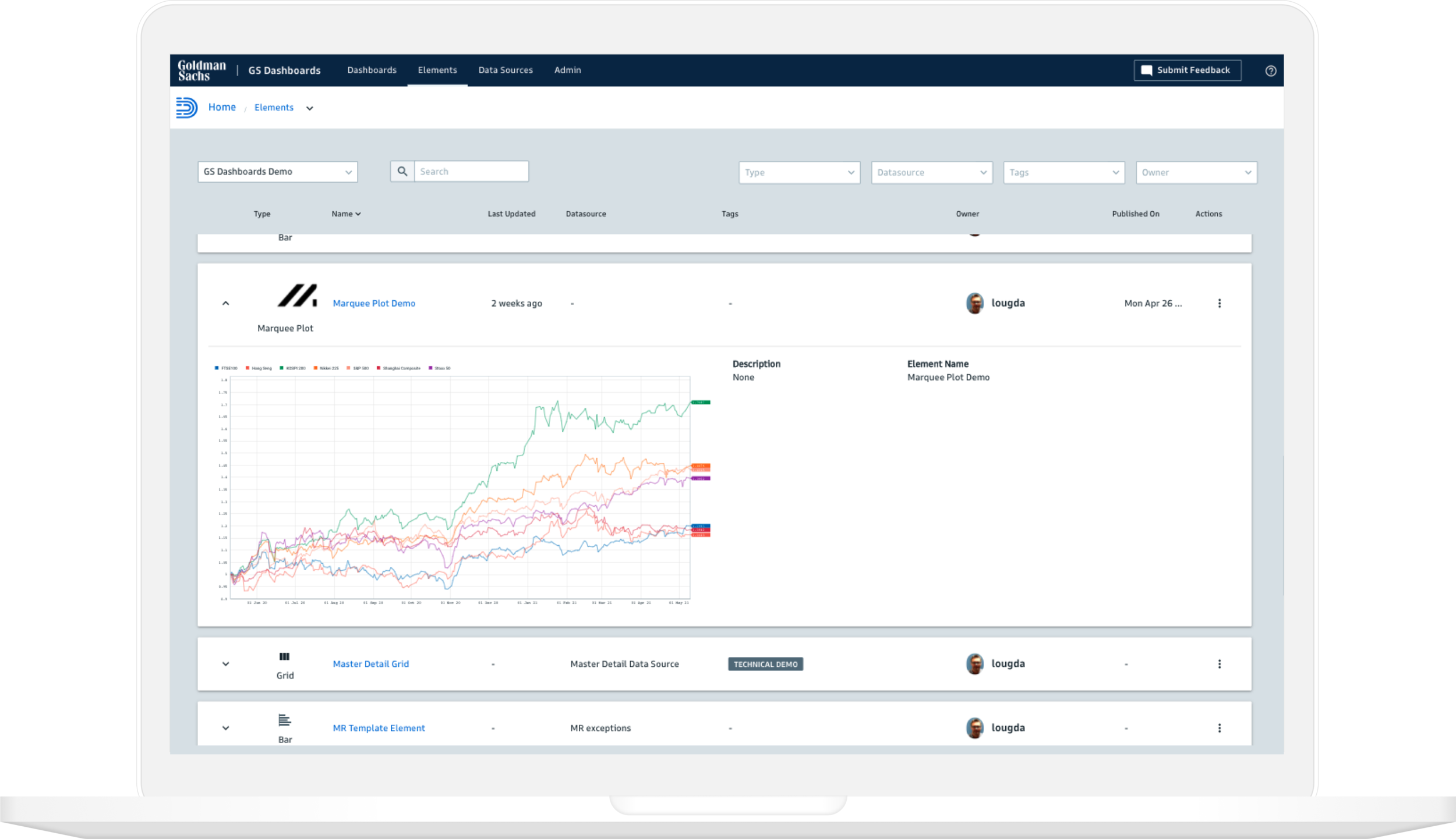
Data is displayed on a dashboard using reusable visual components from an extensive library.
The application allows teams to set controls around who can create, edit, review and approve resources in their project.
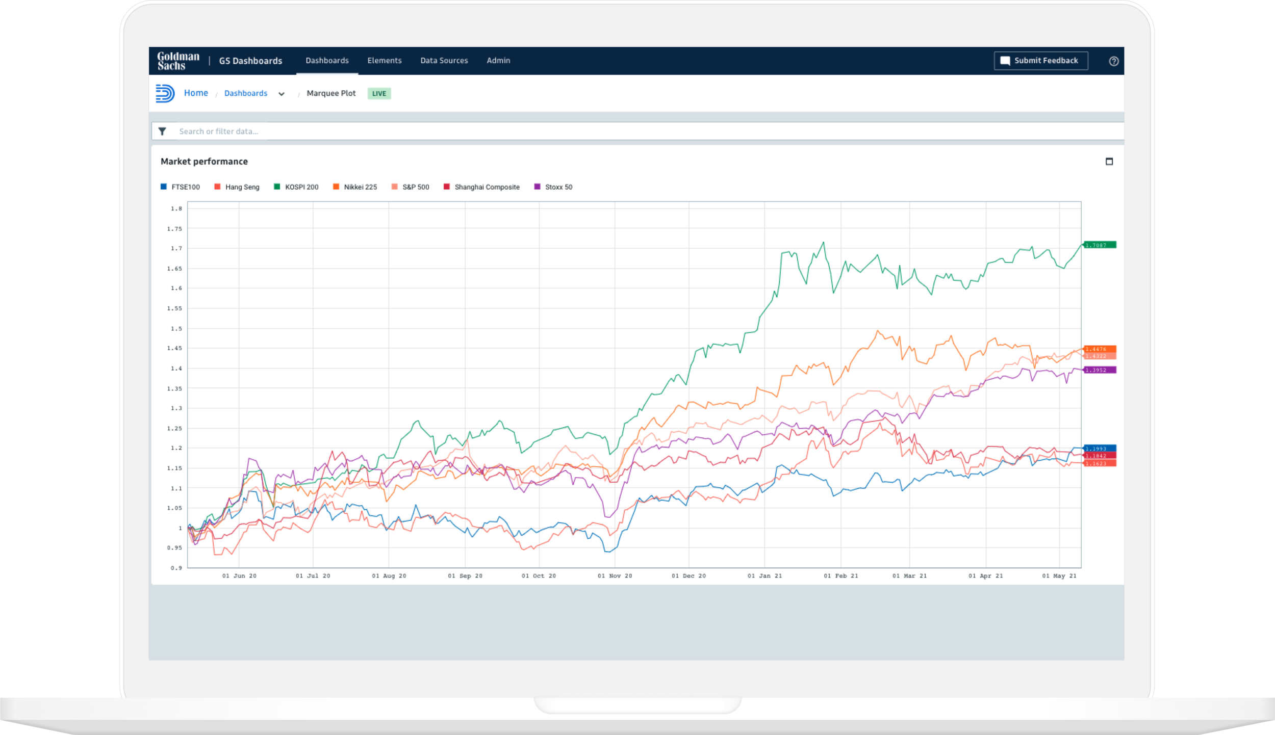
Two charting libraries provide a flexible set of visualizations that leverage the GS Design System.
Teams can create multiple projects and manage resources through a governance process.
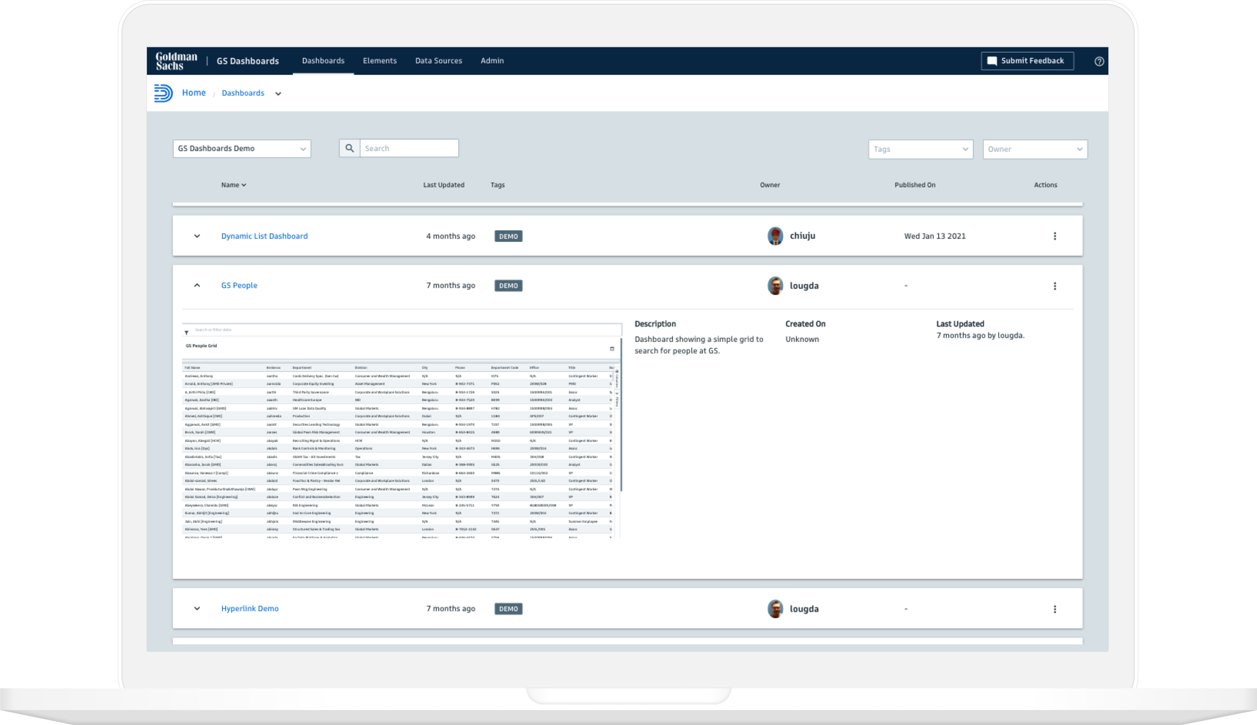
The application provides access to a shared resource library of elements that unlock the potential of the data.
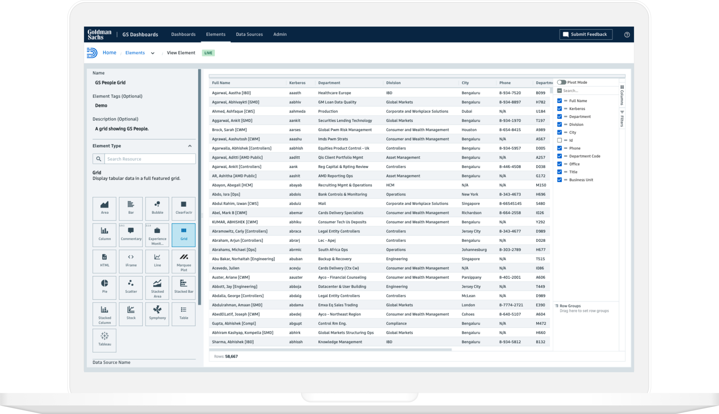
A high-performance, feature-rich data grid enables rapid, server-side slice and dice of massive datasets.
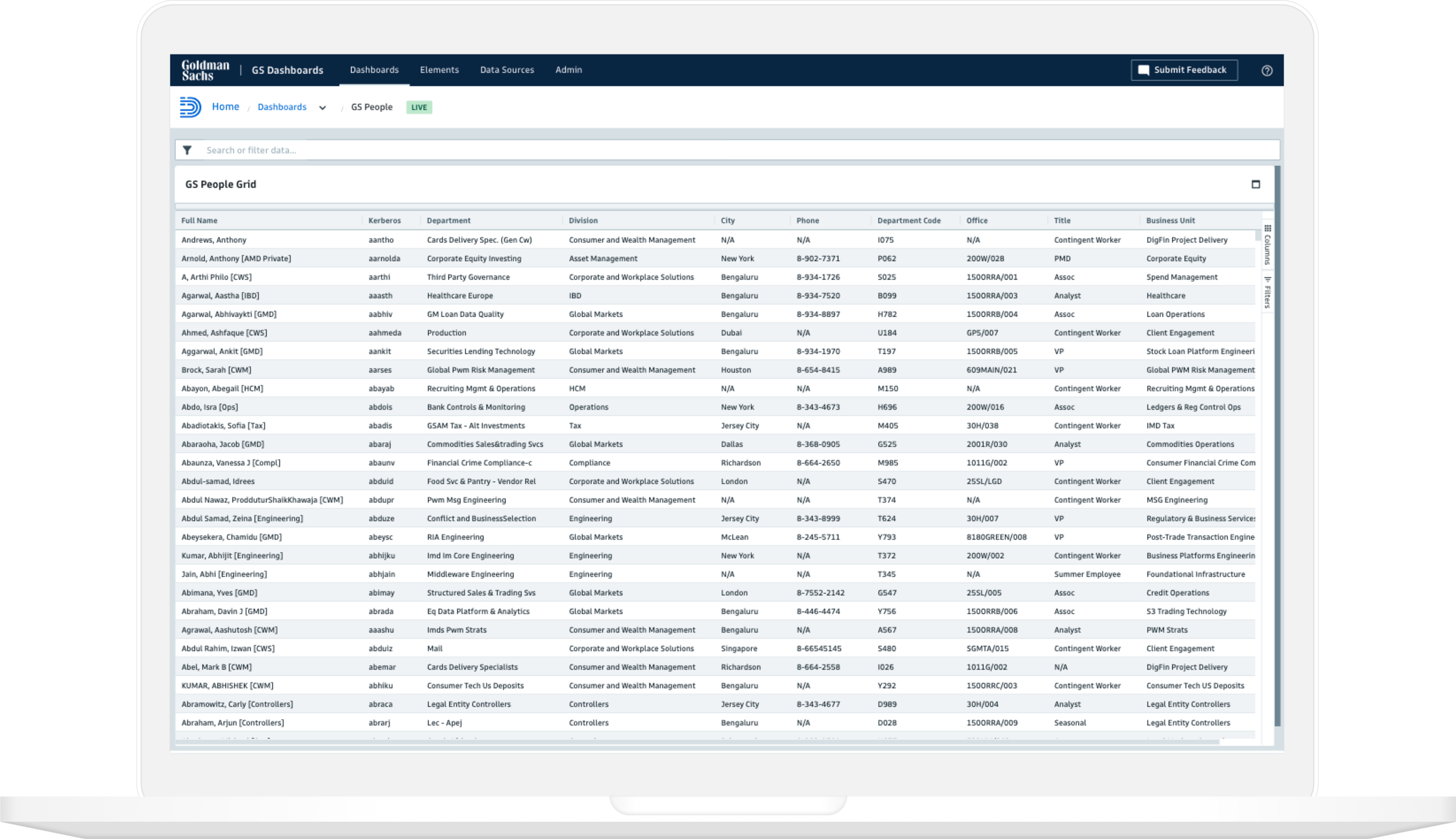
The application provides a range of options for working with large volumes of data.
design.gs.com
design.gs.com is the home of Goldman Sachs Design System’s philosophy and design principles.
The Problem
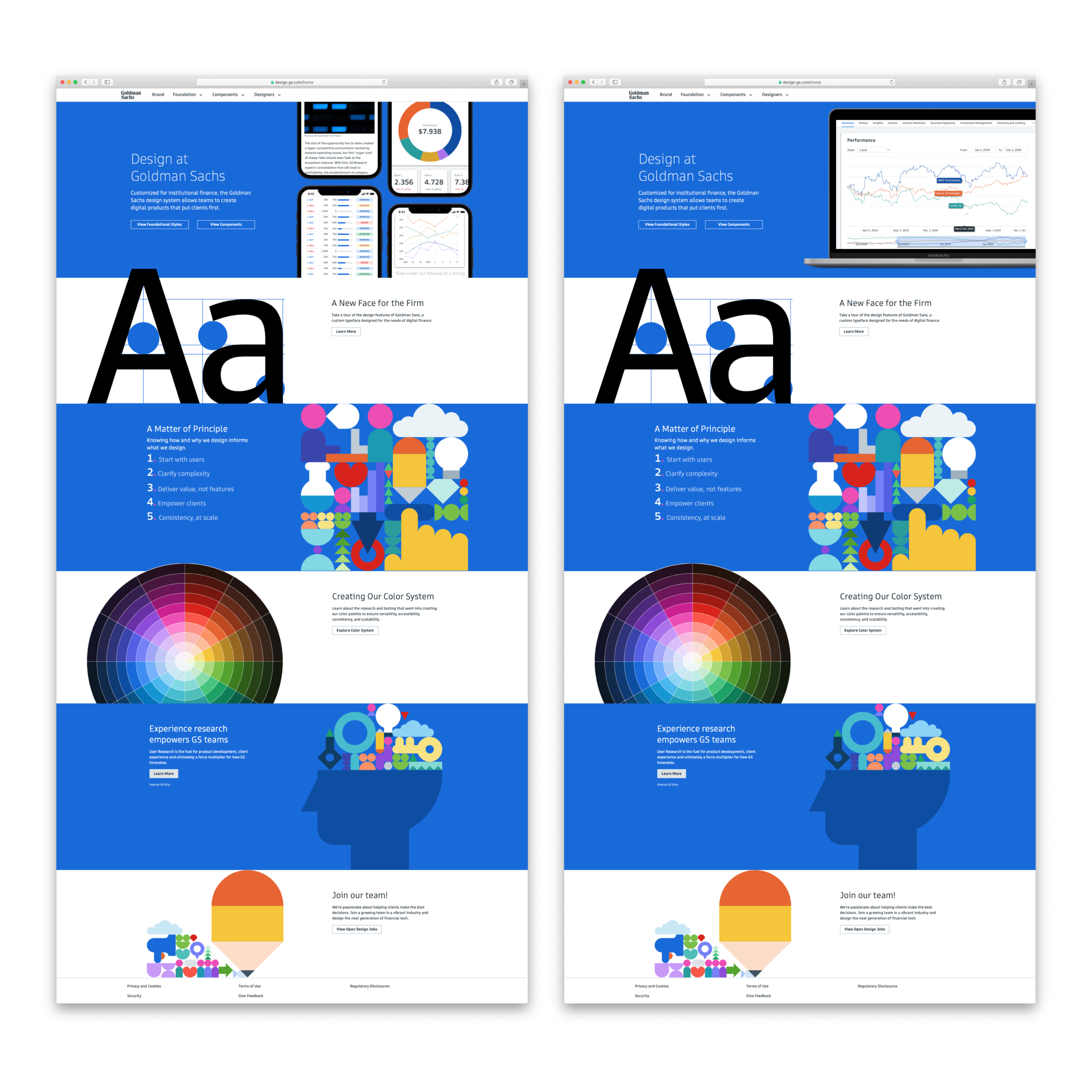
The Goldman Sachs Design System team needed a new website to feature the latest collection of reusable components, design elements, and foundation guidelines.
The Goal
The objective was to design a new homepage for design.gs.com that features the latest design contributions, improves navigation, and highlights the design system’s foundation (e.g., typography, color system). In addition to redesigning the homepage, we created an illustration style that features the new color system and layout grid.
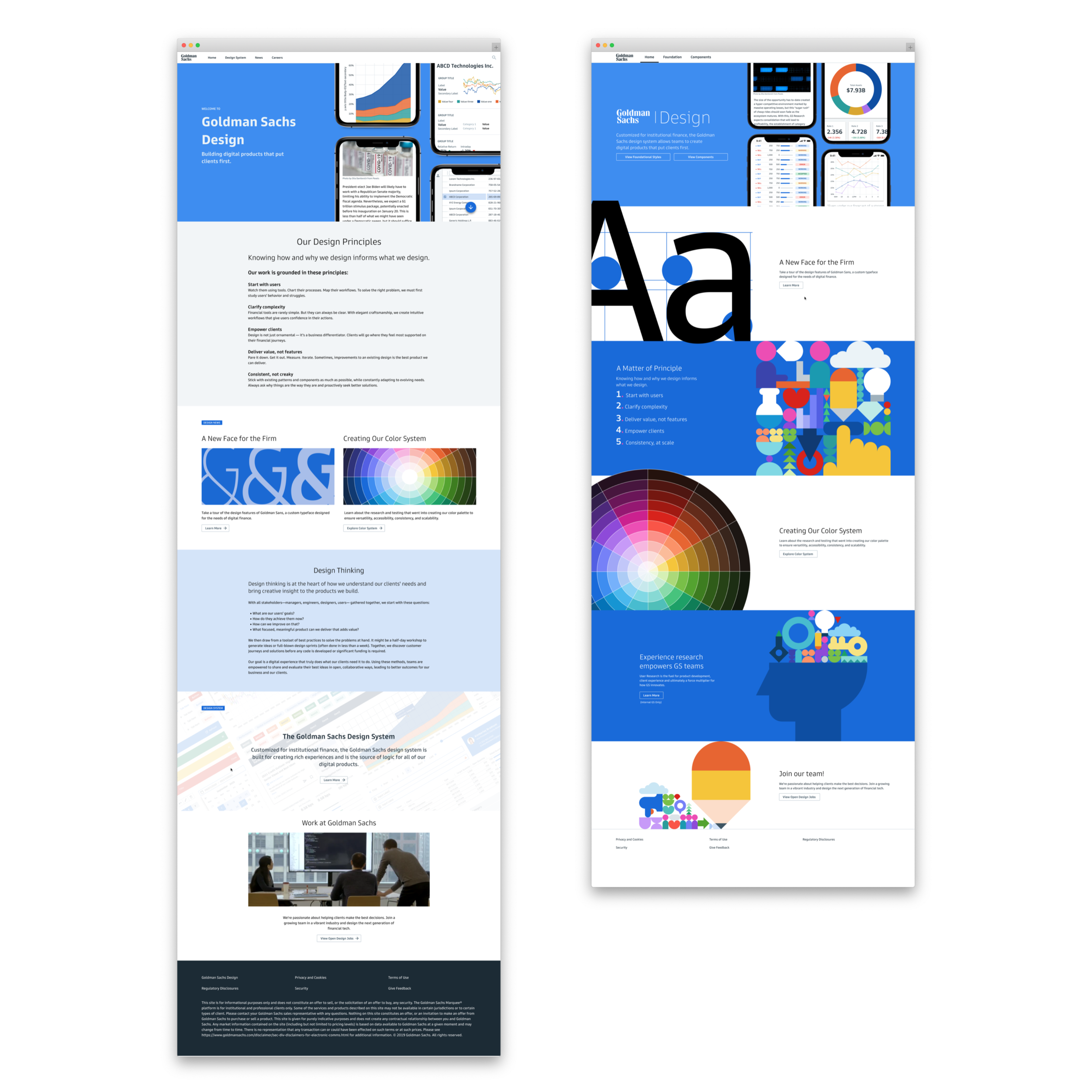
The original homepage (left) was designed in a modular format, making it harder to highlight new content. The redesigned homepage (right) allows designers to feature key topics and makes the page more dynamic.
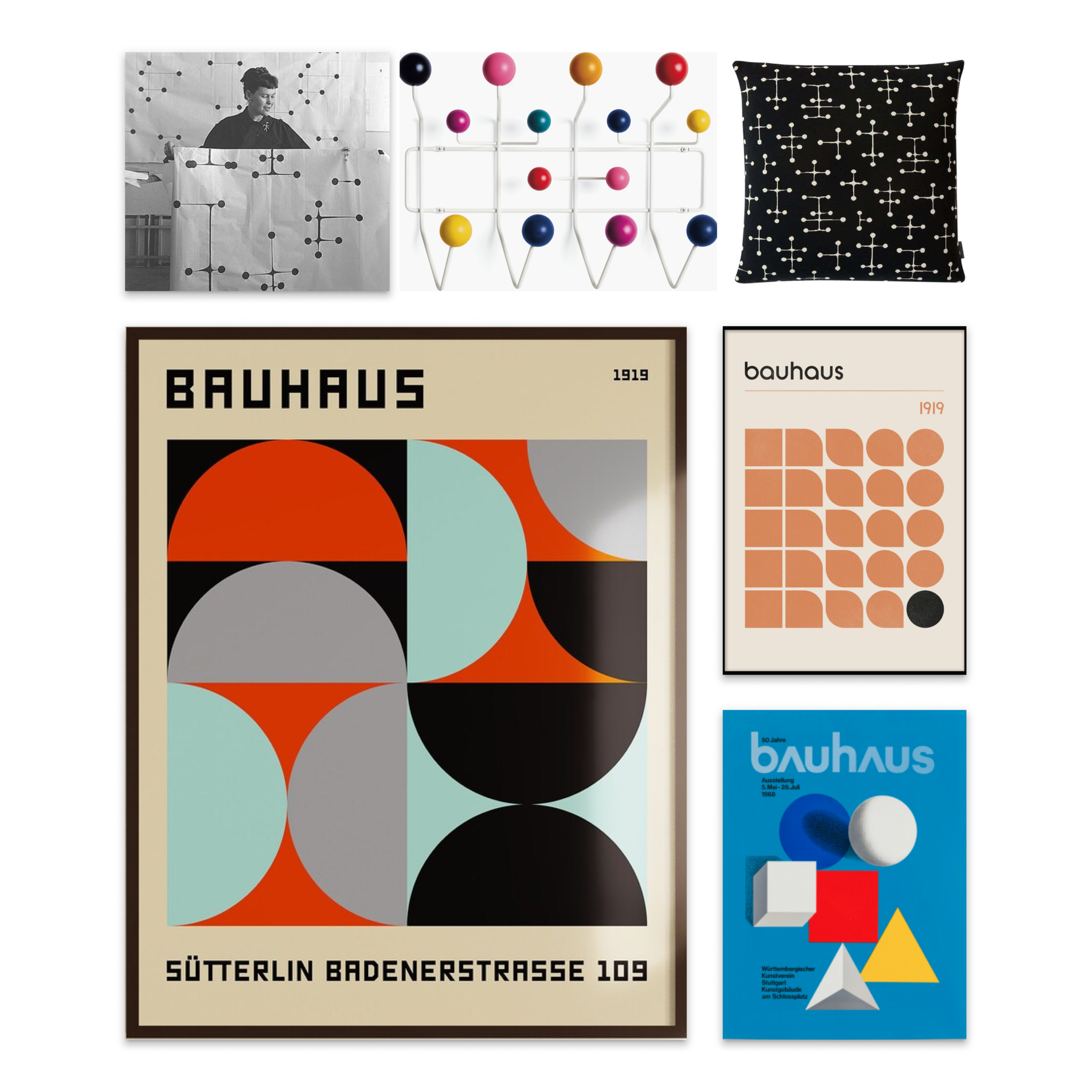
The inspiration for our illustration came from the work of Ray Eames and Bauhaus design.
Our design explorations started with primary/abstract shapes and evolved into a more representational style.
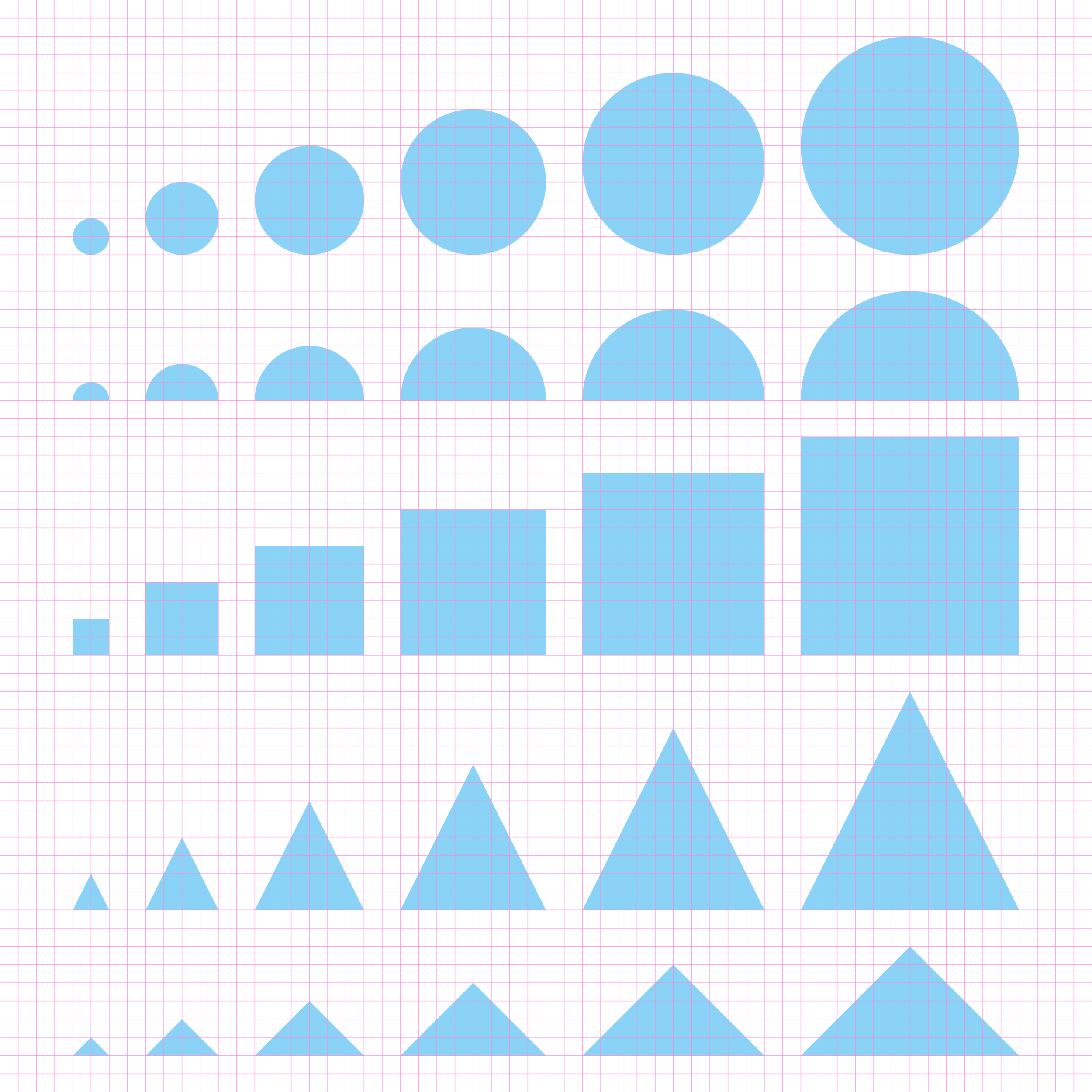
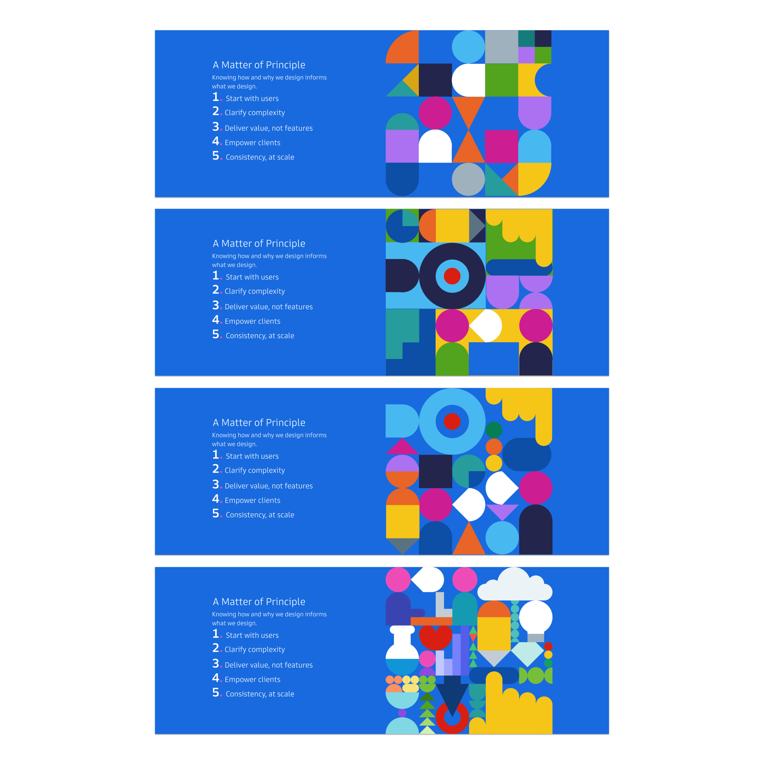
We constructed our illustration style using basic geometric shapes based on our standardized grid and spacing system.
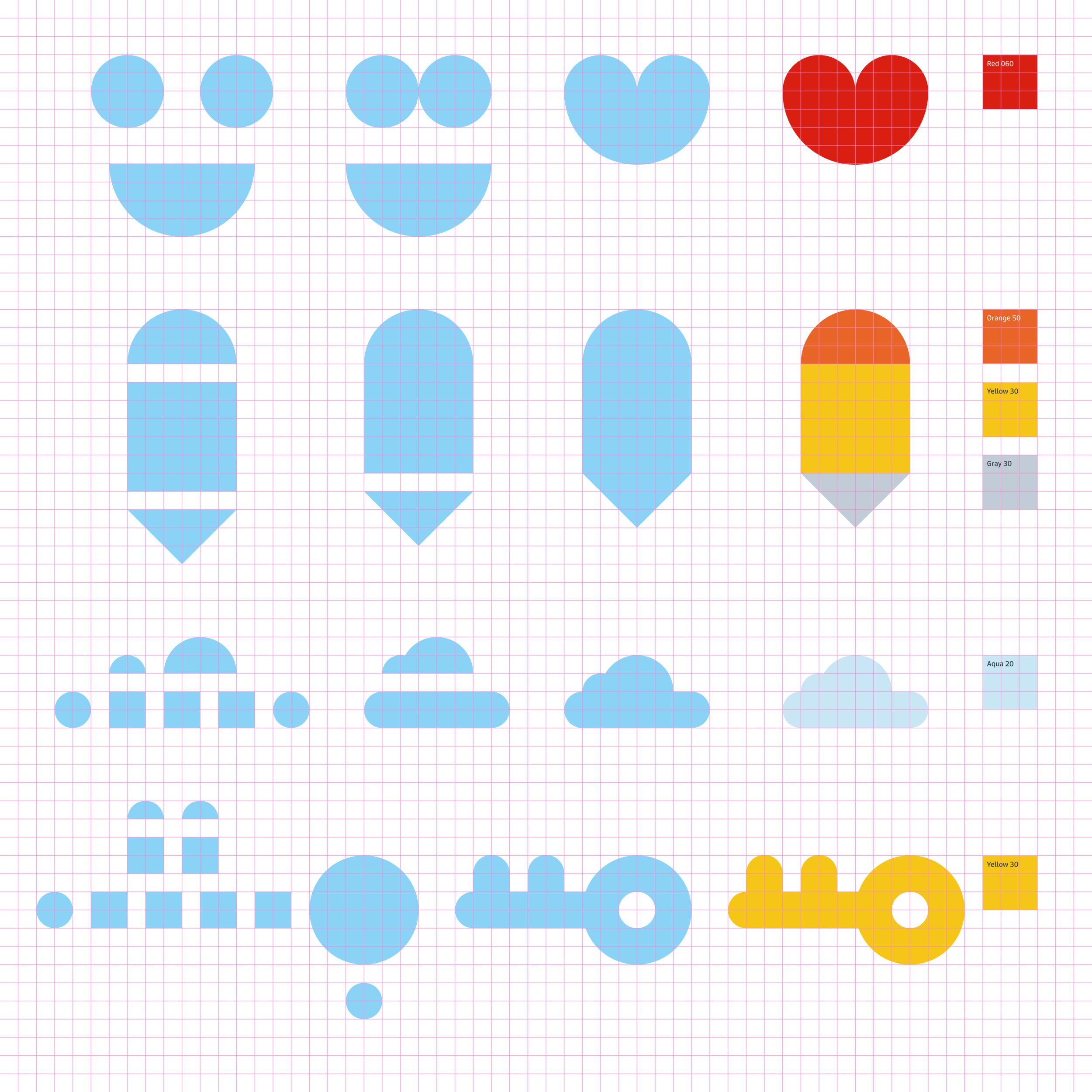
Basic shapes come together to create a pictogram. We use colors from our color system to set the tone, give meaning and reinforce our design system brand.

Pictograms can be combined to create hero images for higher-impact moments.

Our illustration style highlights the new color system, helps us illustrate our message, and adds visual joy.
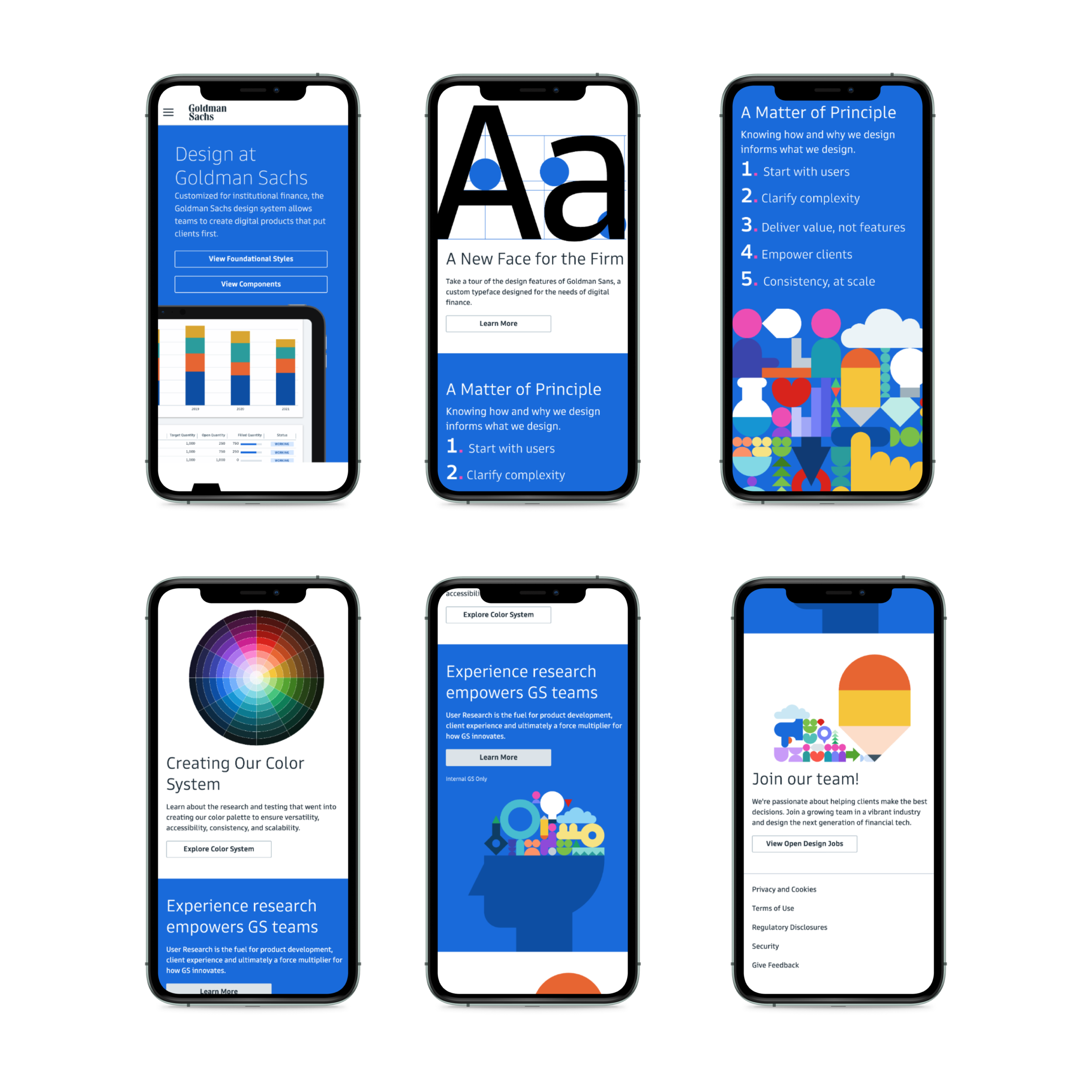
Our illustrations style is colorful, bold, simple, and can significantly impact various spaces, applications, or platforms.
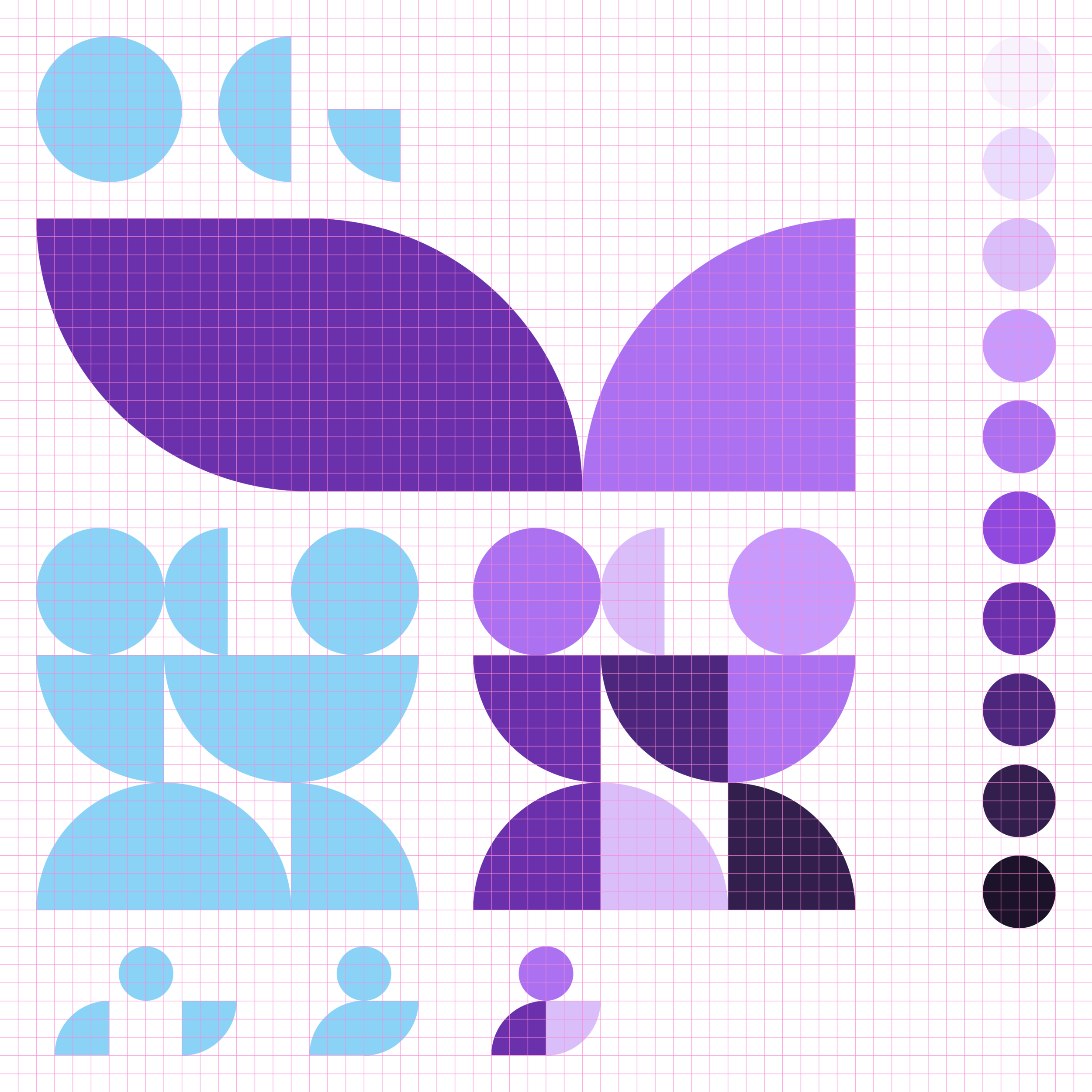
Our illustration system is flexible enough to allow designers to create different variations while maintaining a consistent and unifying aesthetic.
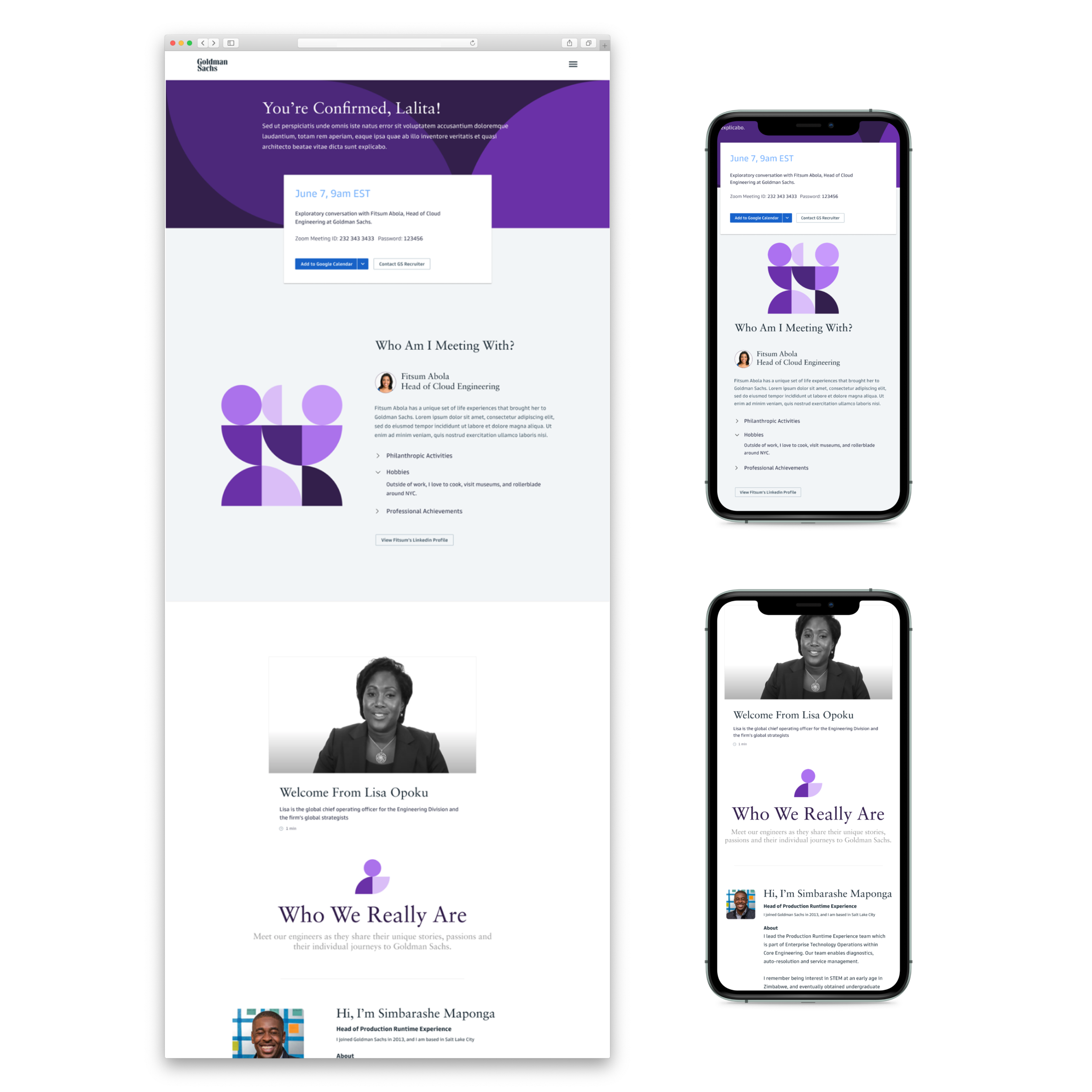
Other teams can implement the illustration system to brand applications, increase the interface aesthetics, and communicate richer narratives or concepts.